
To start of this unit I have decided to research 12 posters of previous festivals including other Womad Festivals. I think that this will helpful because I can see what themes other designers have used when creating there posters.

This was the first Womad picture that I found. After researching Womad posters I found this picture on Pinterest.
I like this picture because its stayed within three colors limit. I also think that this poster is effective because it shows a lot about the festival. At the bottom of the poster the name ‘WOMAD’ has been designed using all three colors within the posters. This is good because it makes the name very noticeable and clear that it is about the festival.
As many are already aware Womad is a festival about alternative / indie music from around the world. The drawing shows a character with 12 arms playing all shorts of different instruments. This shows that there will be all shorts of people from different cultures playing different instruments.
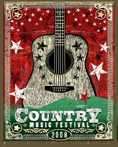
This poster was made for the Country Music Festival in 2008. I decided to include this in my Womad blog because it has been designed in a very similar way to what I would expect to see on a Womad poster. Again it has used only three colours but still holds a cultured / alternative theme. The design shows both a flied and a guitar which shows that it is a folky festival hosted in a flied.
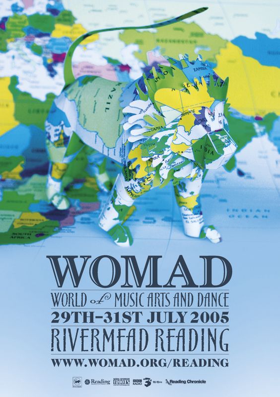
The 2005 poster seems to be very different to the more modern ones. All of the modern ones seem to have a african theme with view Colors.
However this poster does still hold the same message as many of the other posters. by showing the worlds map it suggests that the festival is all about music from around the world. It also still has the Womad mascot which is a lion.

This poster was also not designed for the womad festival, yet it is still a great example of what should be expected from a festival poster. It has a very clear title with the festivals dates and line ups as well as two drawn images of the festivals themes.
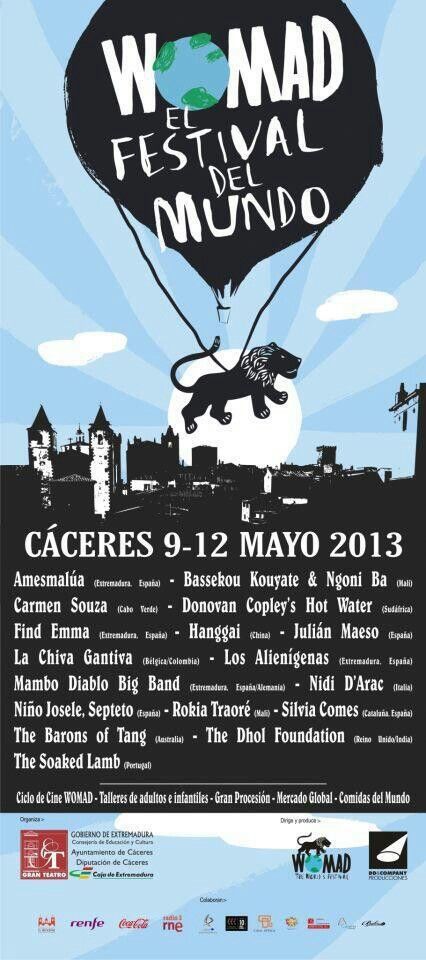
As Womad is an international festival it is held in many different countrys across the world. Unlike all my other poster which are from British Womad festivals this one is for a spanish Womad festival. This poster also shows the lion. The ‘O’ from Womad has been displayed as the globe which suggests the music is from all over the world.

This poster is not from a music festival but a one of music night at bar. This is a good design because it is very minimalistic and will grab the attention of many passers by.

Womad are also known to hold night events at Bristol Zoo. This is a poster for there event in 2011 which I attended. This poster shows what it will be like very well. The idea of this event was to see animals of the whilst listening to the music of the world. This is shown very well by having the loin made out of vectors of other animals that you may find in the zoo. This was a very good event as a percentage of the made profits went to the Gorilla Conservation. (This is also advertised very well within the poster).

This is another poster advertising international Womad festivals. This particular is advertising festivals in; Spain, Mali, Turkey, America, France and Jamaica. This poster seems to have an old school theme

This Poster is from the 2014 BoomTown festival. Unlike many other posters featured here this one is made mainly out of text with good graphics on the side. I think that this poster has been decided will because includes all the relevant information about the festival and some of their main line ups. each paragraph of the text is in a different colour so it easy for people to read.

This is a poster for the Glastonbury festival in 2002. I find this poster very interesting because it was made before the festival was huge. The ticket prices seem to be very low (compared to todays prices) and the primary way of booking was through telephone. Although very outdated by todays standards the lay out and instructions on this posters are very clear and self explanatory. The Illustration of the three characters dancing is good because it is eye catching and suggests what the may happen at the festival.

I think that this festival poster for BangFace 2016 is very effective. The Designer of this poster has reused the design of the famous ‘Now that’s what I call music’ logo. In the BandFace poster it has been redesigned to say, ‘Now that’s what we call BANGFACE 2016. I think that this design is very clever because the ‘thats what I call music’ brand is very well known and recognised. By redesigning it for bang face it will also be instantly recognised, people will also be more likely to read it because they will find it amusing. BANGFACE is a festival that often takes place in early march of every year, they are also known to hold night gigs in popular clubs such as Lakota. Bangface often plays Drum & Base and Jungle music. I think that this genre is well reflexed in the poster as shows disco lights and people dancing.

I think this poster has a very good design. It is very colourful and attention grabbing. This festival is set in the summer and the bright colours and blue sky represent this very well. In the poster there is a image of a guitar, paint brush and spatular which suggests that there will be music, art and food. This poster is also featured on a farm with brans which suggests it will be hosted on fields and farming land.
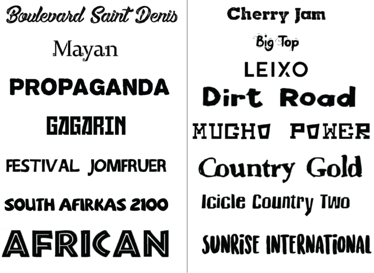
Here are 16 fonts that I have taken of dafont.com. I downloaded these of dafont and put the into a collage so I could see what they look like and weather its worth using them in my final collage. I think that it is very important to trail a number of these fonts so I can be sure what they will look like and make a decision whether they will look good in my Womad poster. By lining them all up together I can easily compare them and decide which one is the best for my poster.
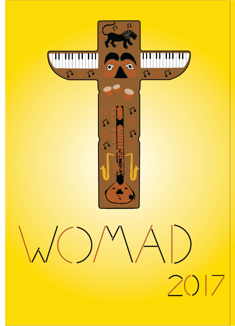
This is my finished poster for the Womad festival. I had made this poster on Adobe Illustrator and tried to give it an native american theme. For this reason i decided to make the centre of focus on a totem pole. Rather then different faces inside the totem pole I decided to put in different instruments which artists would play at the Womad Festival. Overall I think that this was a good idea which followed the brief to make a colourful Womad poster with a strong theme from country or culture. Despite this poster fitting in with this theme I think that the final design could be improved and made to look a bit more detailed and well drawn.
Despite my font research I decided to create my own font for this poster using the pen tool. I think that this part of the poster looks very good because it is unique, easy to read and made by myself. I think that this is better than taking a font of dafont.com which isn’t orinagally and will be found on many other posters.
My Design Process:
The hardest part of this poster to prefect is was the african Sitar. The majority of my time was spent on making this and explains why the rest of the poster doesn’t have as much detail. If I were to make this poster again I would spend less time on the sitar so I could give the rest of the poster much more detail.
