Unit 38 Mixed Media Image Making

Ideas & Development Research:

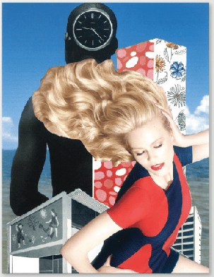
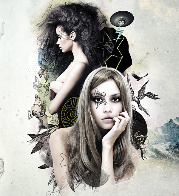
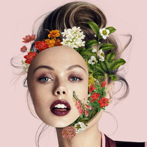
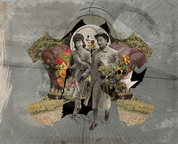
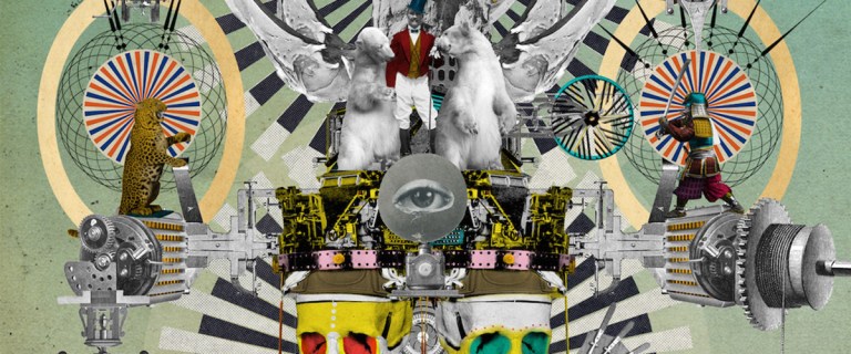
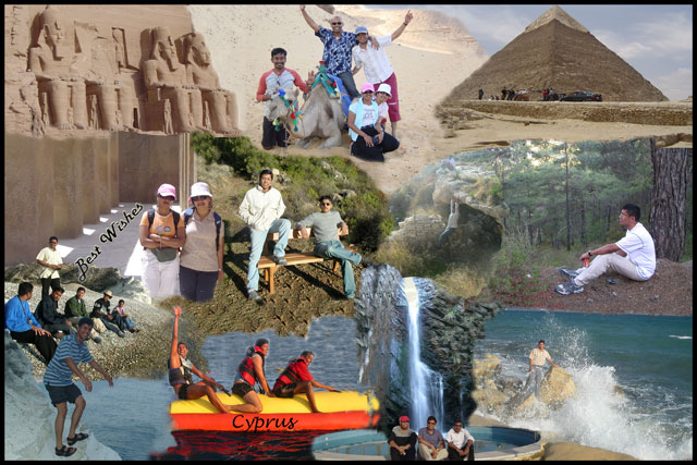
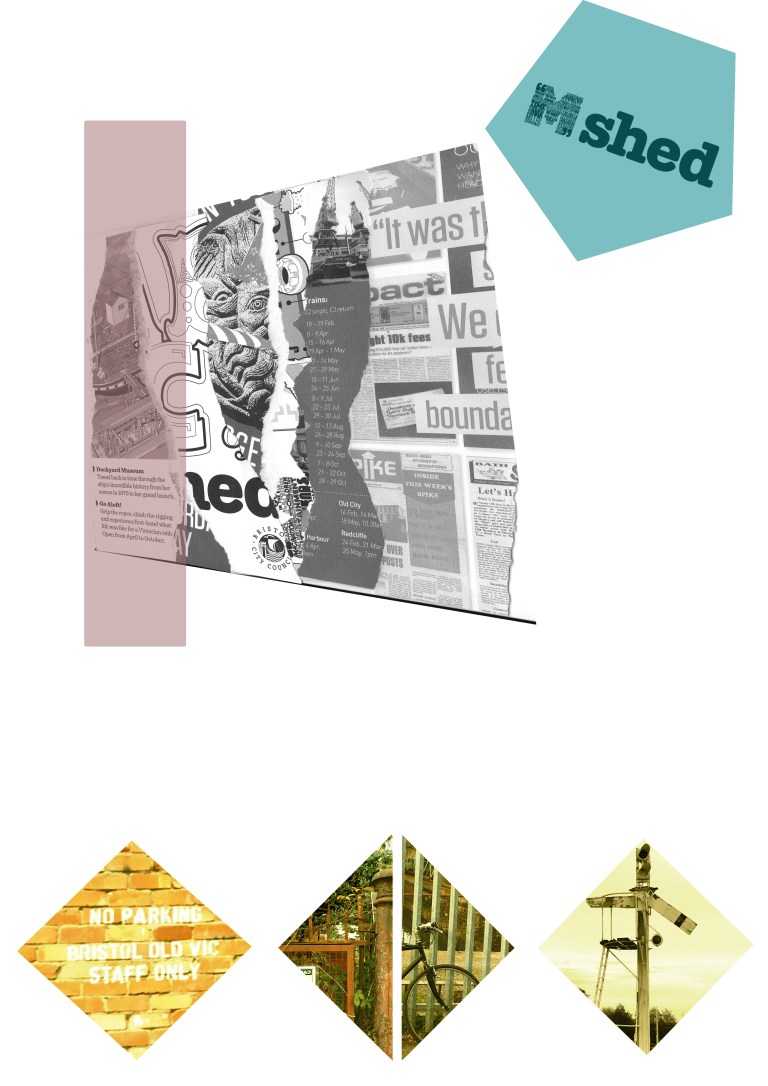
Below is a list of collages made by other Graphic Designers. I have picked them all out because I think that they are very well designed and portray messages in many different ways.

screen-shot-2017-02-03-at-11-11-02
This picture has a lot of different components to it. It has different pictures from all areas of life which tells me life is about adventure. This is shown by the way that all different areas of life are mixed together. The leaning tower of Pisa is next to an elephant which typically found in africa. By having to different parts of the world next to each other shows me that are many different things in the world that can be explored. The way the woman is being lifted up by a ball shows me that the world can take you anywhere and you can witness so much. She also seems very excited which tells me the world will never disappoint you. There is also a speech bubble by the elephant saying, “I don’t remember anything”. This means that all the adventures should be spontaneous and fun.    
screen-shot-2017-02-03-at-11-11-29
This collage has images from many different places. I like they way that they have all been placed together to make a very colourful collage. I also like they way that the man is in centre of the image inside the arch making him the first focus point. Another good thing about this collage is that all the images fit very well together even though they have little  in common with each other. Many of the pictures are from different cities. Like the previous photo this symbolises adventure to me. 
screen-shot-2017-02-03-at-11-11-39
This collage seems like it was quite easy to make yet very creative and shows that the artist has thought out side of the box. The message of this collage is quite unclear yet it seems to symbolize mystery and gets you thinking.
screen-shot-2017-02-03-at-11-11-49
I like this one because there is a lot going on and a lot for a person to focus on. I think that is good because it will encourage people to look at the collage longer. The way it has a clock , office buildings and a woman in rush is effective because it reminds people of a busy city. I think that the clock in the back of the mans head symbolises that society is very time orientated and that time is something that everyone must accurately follow. The way the women’s hair is spread across the picture shows that she is moving quickly and it is wind brushing against her. She is most probably in a rush to get somewhere on time which also shows how life is very time orientated. The buildings in the background seem to be a home and an office which is the two places that most people rush to and from. 
3-collage-photoshop-tutorials
I particularly like the way that this collage has been designed. At first glance it looks like a normal photoshoot of two women, but there is so much going on in different parts of the collage. Each different part has a different character with something unique going on. This is very good because it allows the viewer to keep looking at it and enjoy many different parts of the image. There are many different things in the background including a cowboy, astronaut and alien spaceship. All these extra details makes a rater average image much more interesting and attention grabbing. 
57f68cdc72a6679ed7e57acbb70332ce
This image is very good because it shows that simple editing can still be very effective, all the artist has done is move the woman’s face and place flowers inside her. Although this isn’t much it has still proved to be very effective.
126482b1ccdbc57b10fae6bc75747c00
I believe that this is very affective because it is a collage made out of very old photos. To me it looks like these photos were originally taken in the 1930s. This is affective because it is very unique to what over graphic designs do. All of the other pictures seem to be colourised which makes the two women who are still in black and white standout. This makes them a good point a centre focus point. The grey background also makes the colourised photos stand out. 
1443358741031
I particularly like this one as there is so much going on. This will get a lot of people looking at it for a very long time. There is a lot going on and will get anyone looking at it for a while. It seems to have a circus theme with many different animals and a circus presenter. There also seems to be some film that suggests a lot of people will record and film the circus. The way that this collage is very random shows that is designed to leave people thinking.
download
I like this collage as it seems to have a very positive message. It has been made out of pictures witch are very bright and colourful. The designer has also changed a ‘stop sign’ to say ‘Start Living’. I think that this is very effective because they have taken something that is originally demanding and negative and made it positive. I think the start living message is trying to tell people to enjoy there lifes and to make the most out of it. Underneath the sign there is also fruit and veg which is healthy food that will help a person stay healthy and live longer.  To the left of the collage there is also a women with many different types of objects and street art. I think that this symbolises what a person can see and create if they start living there life and exploring the world. 
gopal
This collage looks like it has been made to show highlights of a family holiday. It seems to have many different pictures from Cyprus which fit in well together as they all have similar colours. I think that this is a very effective way of showing holiday photos because you are able to see all of the holiday highlights at once.  
images
I also like this collage because it has very bright colours and is subsequently very eye grabbing and will make people want to look at it and enjoy it. I like how the designer has cut several buildings and put them in a grassey background which makes you feel like you are in nature and open space. 

Assignment 1:

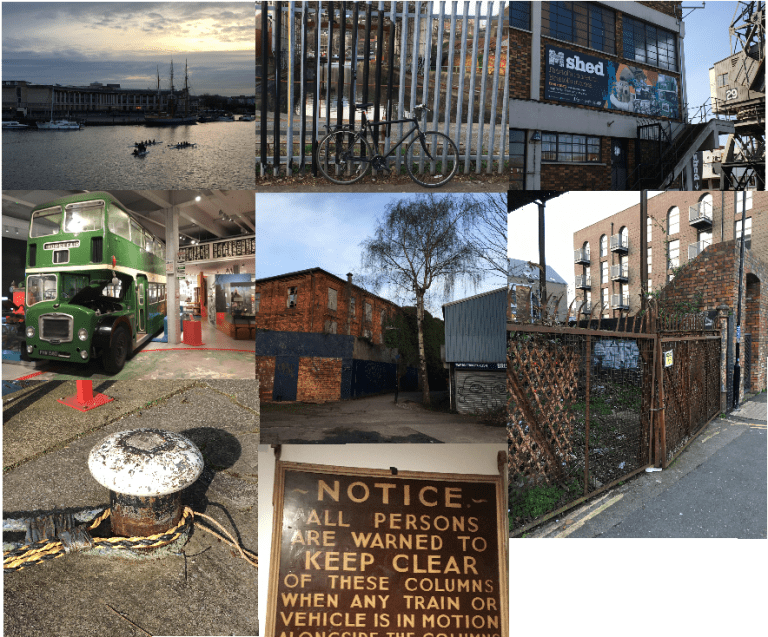
As part of this unit we are required to make out own collage. I decided to make mine with a theme of the Bristol Harbour Side.  We had to make this collage on Adobe Photoshop  and focus on small details from the area. It is for this reason that I took photos on my iPhone of different parts and features from the harbour. I took many different photos from the harbour side. Below is a collage of some of the photos that I may use in my final collage.

Load Of Pics
These are some of the pictures I took from the Bristol Habour side to use in my final collage.

I also made this collage by hand out of magazines from the habour side. My original idea was to include this into my final collage however I decided against this as it did not look good in my collage.

Collage, Collage2 (1).png
Examples of other collages I like
Failed Design
This was the original design for my collage however I decided that I did not like this design and have decided to submit my second design (shown below as my final piece)
Habour Side Collage
Final Collage

Design Report:

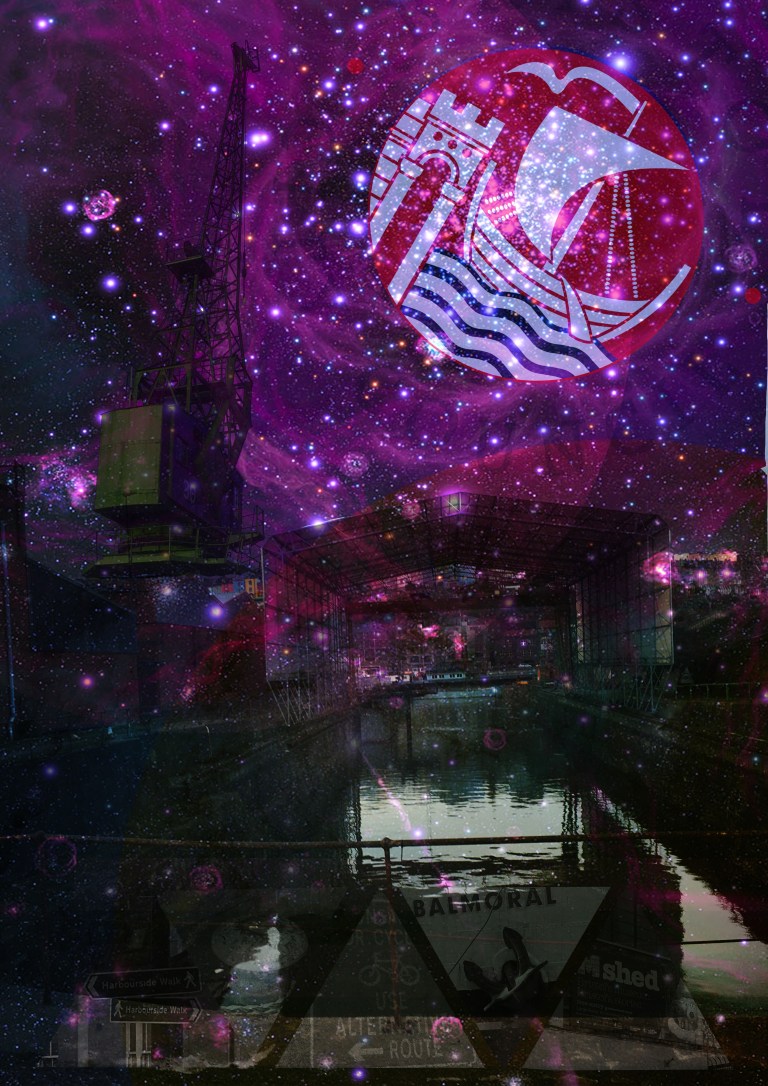
This is my final collage design I think that this is very effective and shows of many different attacrtions of the Bristol Habour Side. All of the pictures features I took myself by exploring the local area. I carefully selected all the images used to show of the rustic features of the harbour side as well as all the touristy locations. The Harbour is famously known for its four Fairbairn steam cranes which where constructed in the 1870s. As these are a key part of Bristols history I thought that it was important to include them in my collage. This is why I photoshopped it out of its original background and placed it to the left of the college looking over the rest of the harbour from the sky. As the main background a choose to use dock behind the SS Great Britain. I think that this was an important asset because it is where many of bristols cargo ships where bliut and unloaded. I also decided to give it a galactic night theme because it makes it seem more magical and interesting. By giving it a night time theme people can focus in on the stars and witness the harbour side at nighttime. I also replaced the moon with the Bristol City Council logo because it shows a boat on the harbour and fits in very well with my design.  At the bottom of the collage I also including small features of the Harbour side to gain a feel of the local scenery I cropped them into a shape of triangles so they could fit in well together.

Devolpment:

Here are screen shots of how I developed this project.
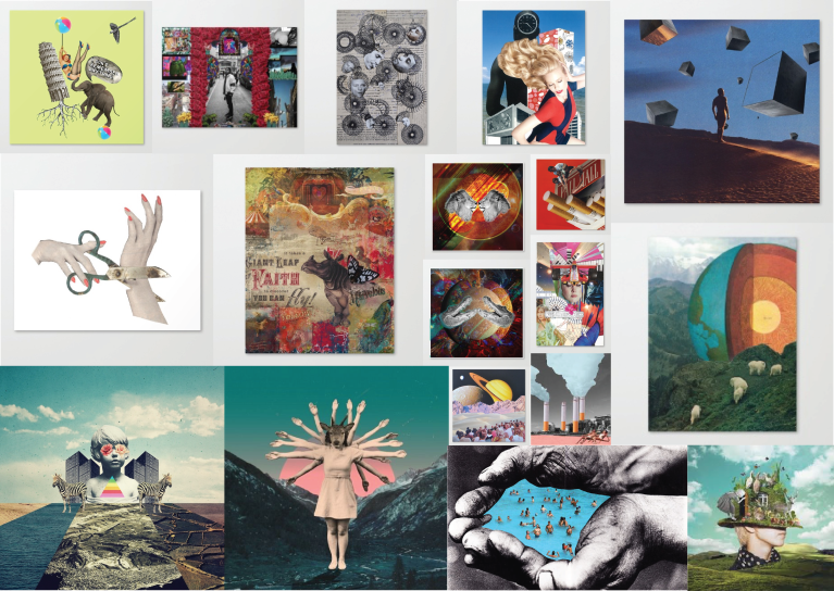
Other Work

flowersjpeg

Leave a comment