Ideas & Development Research
In unit 42 we are required to design and publish book covers for two books of our choice. The purpose of this unit is to show that we can design a product efficient and make all the relevant information fit into the correct place. For example a book cover can be quite difficult to design because the design has to look consistent in every area of the cover but still work as an effective book cover that shows the right information in the right places. Designing the front, spin and back to look all fit into each other can be challenging.
As I previously mentioned we are required to design two book covers. One most be designed to show mostly graphic and must be quite artistic and the other must gets its message across using mostly text.
For my typographic book cover I have decided to do Roald Dahl’s Charlie and Chocolate Factory. I think that using this book as my typographic book cover will be effective because I can design the book cover to look like a chocolate bar and the text and the title can be a replacement for the branding. Chocolate bars are always covered in texts and branding so I don’t think that it will be to difficult to change it to make it the title and blurb of Charlie and the Chocolate factory. Designing this book to look like a chocolate bar is also a good idea because the book is mainly about chocolate and Willy Wonka’s Wonka Bars. By making the book look like a Wonka Bar it is fitting in with the theme of the story and giving the reader a clue of what the book is about. It will also help them picture what a Wonka Bar may look like when they read the book.
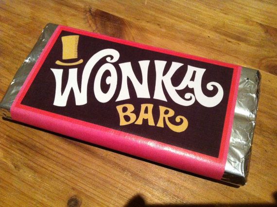
This is what the Wonka Bars look like in the film and on some real live parodys. The design on all Wonka Bars seem to have a red border with a brown cover. I will try to use this design on my book cover as much as I can. One thing that I will have to change is that I will have to design it in a portrait orientation this is because books are read in this position and will be the expected design this may become challenging because all chocolates bars are designed in a landscape orientation. I do believe that this is a very effective design and I will be using to inspire me when designing my book cover.
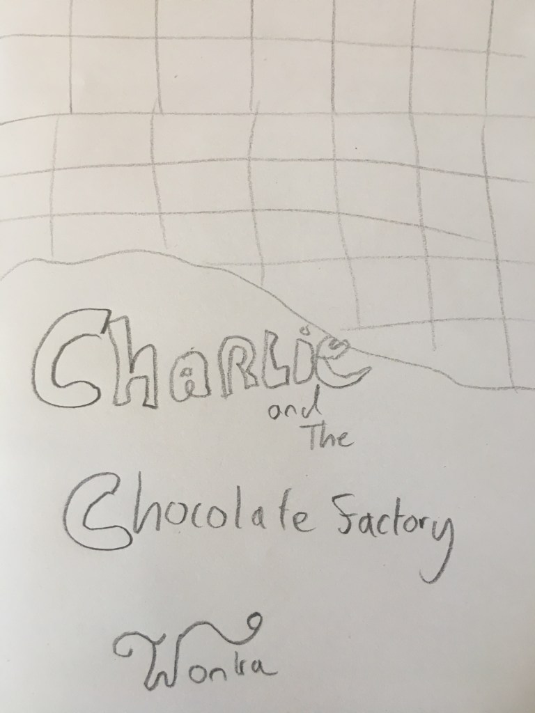
This is a very basic sketch that I made to help me get an idea of how I will design it. When making the actual cover on Illustrator and Photoshop I will refer back to this and Wonka bar and use both of them to help influence my design. As you can see on my sketch I will make it look like part of the wrapper has been ripped of and draw bits of chocolate to help give the effect that it is a real chocolate bar.
