Activity 1
Adbusters Spoof ads:
To start of unit 4 we are required to look through different advertising campaigns by large companies and then find eye-opening spoofs of the same advert.
Calvin Klein:
Calvin Klein is an upmarket clothing and fragrant company. All of there products are known for being very pricey. To help appeal to customers all of there products are showcased photoshopped supermodels which subsequently gives a false sense of reality to members of the public and there target market.


To the left is an original Calvin Klein poster from 1992, which shows the hollywood actor Mark Wahlberg showing his six-pack while wearing Calvin Klein underwear. Throughout there history Calvin Klein have produced and released posters like this for male and female products. Which has been known people to feel less confident in there own body.
The poster to left is a great parody of these which I found whilst browsing through the adbusters website. This picture shows the body of a more average person. It is cleverly titled ‘Reality’ which shows that is what the majority of males bodies look like. I think that this is very effective because it quite eye opening and shames Calvin Klien for showing a false sense of reality.


Camel Lights released many adverts like the one on the left throughout the 90s. They all show Jeo the Camel Living a high and exciting live with the Camel Lights Cigarettes. One of there many ads is shown on the right. On the left is another spoof ad that I found on adbusters. It shows Jeo the Camel years later in a hospital bed suffering from a bad illness brought on by smoking. This fake ad shows the truth behind the product and was created to try and put people of smoking and show them the reality behind smoking and tobacco. Many other effective spoofs of Jeo the Camel were also realised. Camel lights have spotted creating these ads because tobacco companies are band from making ads across the world.
As part of activity one I am also required to gather a range of other posters that influence me and can help me create an idea of what I’m going to design my Cabot Circus recycling poster to be like.


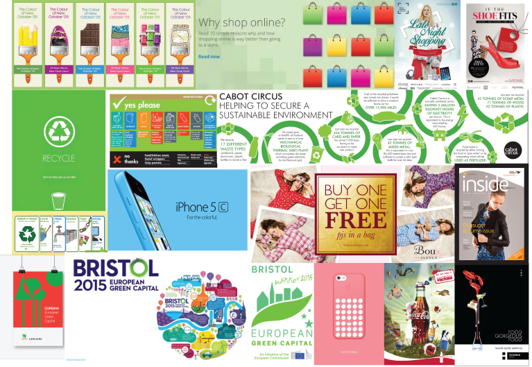
As I will be creating a poster for Cabot Circus I think that it is very important that it fits in well with there other posters and marketing campaigns. By doing this I am ensuring consistency and allowing my poster to fit in better with the rest of the shopping mall. Therefore making the marketing directors more likely to choose my work. Above are several examples of other posters used by Cabot Circus. I can see that all of there posters have a dark background with brightly coloured vectors on top of it. I think that this design works very well because it allows passers by to easily see the main focus of the poster and the text. It is also designed to look very trendy and appealing to younger and possibly wealthy shoppers. By looking at these designs I have decided that I will design my poster in a very similar way. I will give it a dark background therefore ensuring that my designed graphics will stand out as well as the text to go with out. This will allow customers to easily read the poster and grab the attention of those who are less likely to see it. This design will also match with all of Cabot Circus’s other designs and fit in well within the shopping centre.
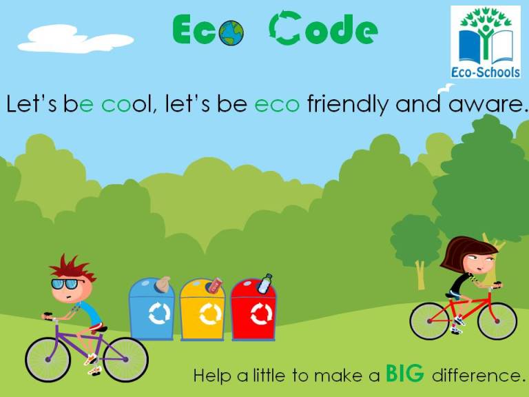
I have chosen to annotate this poster because it promotes recycling and reminds people to be eco-friendly. This is a very similar to what I am trying to achieve on my poster. By looking through this poster and reading its text I can tell that it has been designed for schools and is appealing to children. It has many bright colours which makes it eye-grabbing. The recycle bins themselves have the brightest colours on the poster making them the main point of focus. It also shows to kids riding pushbikes which is an eco way of transport.
What I don’t like about this poster is that its primary colour is green, which in my opion is a bit of a cliche as it is seen on all eco posters. I feel like it has been overdone and a poster with a difference has the potential to be very effective.
What I can see from this poster is that the brigtht colours are effective and help bring the message accross effectivly. I have therefore decided that I will use bright colours on the vectors within my poster.
Activity 2
Produce a mood-board containing relative media posters that influence me to make my poster.
Recipe Poster:
As part of unit 4 we were required to make a basic recipe poster. The purpose in this unit was to show people how to make very basic recipes by creating vectors of the ingredient and illustrating step to step instructions on how to do it. In this task I decided to make a recipe for a radish and tomato salad.
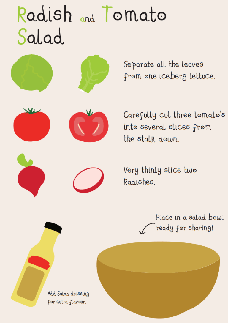
This is my final design for the Salad Recipe. I think that it is very effective because the vectors that I drew are quite self-explanatory and show a person looking at it what to do. I also think that the chosen text fits in very well with the poster is it looks very simple yet approachable and easy to read. I also think that the colouring in this poster is very effective because the key components stand out and are very colourful.
Expressive Words:
Activity 3
Idea development – Here I sketched a few basic designs that would influence my final recycling poster for Cabot Circus. These are very rough drawings that I hand drew on paper to look back on when designing the final posters.
Design 1:
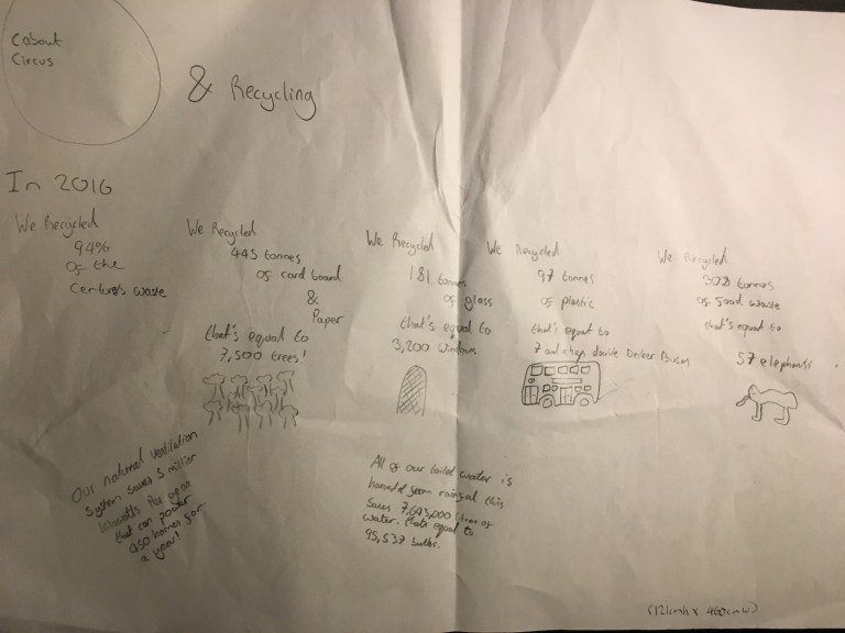
Overall I like this design the most and will most likely use it as the design that I will show to Cabot Circus.
Design 2:
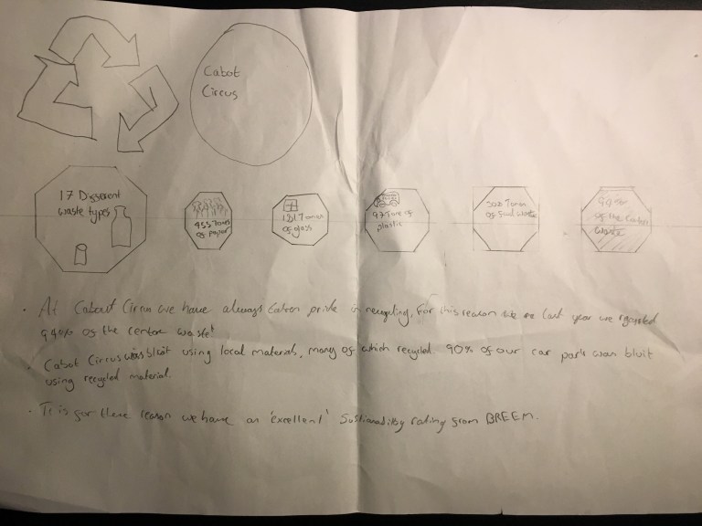
I also think that this design is effective. I will design it to have vectors inside the hexagons with ballot points showing other information.
Activity 4
Below is a PDF of my activity 4 presentation
Activity 5
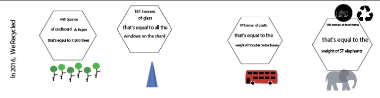
Here are screen shots of my poster as I was designing it and an image of the final result.


In order to pass this unit we were required to make to posters below is my second poster. I don’t think that it is as good as the above one so I will be focusing on that one more in this blog.
Design Report
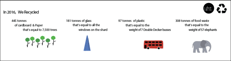
Overall I like design of my Cabot Circus poster. Although the finished product is more on the basic side I think that it is very effective because all of the key points stand out and are subsequently easy for a passer by to notice and read. I have designed it so all of the text is shown in a consistent manor across the poster. Each fact is spread across three with my vectors shown beneath it. I think that the vectors do bring a lot to the design because they make it look more colorful and eye grabbing. Having vectors also helps people to picture the points that the facts are making.
Before I added any content to the board I had to make sure that the design matched Cabot Circus’s requirements. They had told me make the design the following measurements: Height: 121 cm Width: 460 cm. When I was creating the document I ensured that it matched those measurements so there wouldn’t be any trouble during the printing and installment of the poster.
Other important things where that I had to include the Cabot Circus logo. This is important to them because it helps promote there brand and allows people to associate them with recycling and being efficient. This is also why I placed the recycling symbol right next to the Cabot Circus logo. The statements them selves where actually provided by Cabot Circus and where something that they wanted me to add. I think that these are good statements because the get the facts across and allow people to easily picture the amount of items that they recycled in 2016.
