
Ideas & Development Research (P1 M1 D1)
This is the original book cover for Charlie and the Chocolate factory. This cover like all other original covers for Roald Dahl books was designed by Quentin Blake.
I like the design of this cover because it is the original and is assisted with the story of charlie and the chocolate factory. Also throughout the book more images made by Quentin Blake are shown to help tell the story. I think that this cover design as very effective because it shows the basic story line very well. A young boy Charlie going to the chocolate factory and meeting Willy Wonka. They are both shown on the cover with several pictures of sweets and chocolate. The animation is also very appealing to children who are the books target audience. However I do think that the design does lack a bit of colour and isn’t as eye grabbing as some newer covers made for the book. although the cover does tell the story of the book it does lack a hidden message, which more creative covers do include.
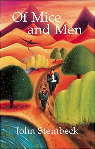 Here is the most used cover for the famous book Of Mice and Men. Of Mice and Men is frequently used in secondary school English as part of the GCSE exams. This is the same cover which is on all the books in schools and sold to the public in book stores. I genially like this design because it has very consistent colours that grab the attention of a reader. The background is made out of orange and brown colours, this makes George and Lenny the central point of focus. This helps people understand that they are the main characters. This cover was designed by Ross MacDonald in 1937 when the book was published. Although this is a very old design I belive that it has lasted through time very well. This shows that a lot of time and effort went into the design.
 This is an unofficial cover for the Romeo and Juliet book. I think that this cover is much better than the original, which I think is bland and boring. I was unable to find who designed it but I believe that it was designed by an graphic designer who created it to add to there portfolio. I think that this cover has a very effective design. This is because it has very few colours that keep the design very simple and eye grabbing. Although the design seems simple it does show a hidden message of what the story is about. It has two hands holding each other from opposite sides of the book which shows that it is forbidden and shouldn’t happen. The way the rose is crumbling in the background also suggests that there love is wrong and shouldn’t happen. The pink background also works because it allows the images to be more easily seen, also pink is a colour associated with love which is what this book is about.
 Harry Potter is one of the worlds biggest book and film series. It is very well known across world. In total there are 7 films and 8 books. In this example I am using the cover from J.K.ROWLING’S 5th book ‘The Order of the Phoenix’. I think that this is an affective cover because the colours are very consistent and the picture fits in well with the rest of the book. The text and the background are shown in red and yellow which are the same colours used to draw the phoenix. The kind of consistency is important because it makes the book look more series and will make people think that the book has a good story line. The image itself is also very good. By looking at it a reader can tell that a lot of effort has gone into it; this should reflexed the quality of the book. The picture also shows the Phoenix in the book which will help people imagine the story when they read the book.

This is the original cover design for the Charles Dickens novel A Christmas Carol. This design would have been made in 1843 (when the book itself first got realised). This is obviously well before computers and graphic processing software existed. For this reason the cover was most likely drawn by hand and printed. Although I can see that a lot of effort went into the design I don’t think that it is very effective doesn’t shoe the story very well. The design also looks quite bland and isn’t very eye grabbing. On a positive note I can tell that the cover was made out of high quality material as its lasted hundreds of years. Also the text is written in gold which is associated with Christmas.
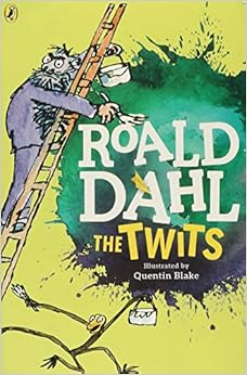 This is modernised cover of Roald Daul’s book The Twits. Like many of Roald Daul’s it has had several different covers through time all made by Quentin Blake. This is one of his newer covers. I think that this is very effective and has a modern touch to it. I think that it is very important to modernise book covers to keep future readers interested in the book. Despite The Twits being written in 1979 and being nearly 40 years old it is still very popular with kids of today. I think this is mainly due to a great storyline, but Quentin Blakes appealing cover is definitely a big part of the books success. The cover is very colourful, fun and eye grabbing. Mr twit is seen on this cover looking very serious dull which symbolises his character very well.

The lord of the Rings was realised in three books. The first one The fellowship of the Ring was published in July of 1954 where the next two books ‘The Two Towers and Return of the King’ was released a few mouths later. I think that all of these covers are well designed and reflex the feel of Lord of the Rings very well. The first book where the audience first begins to learn the story and why the rings are so important in the story line. This is well reflexed in the book cover which contains four rings in the central point of focus there is also a eye in the middle of the biggest ring which shows how important they are.
The second book ‘The Two Towers’ also shows what the basic story line is about. It has a picture of two towers in black and white which is very appealing to there target audience. The last one is also very colourful and eye-catching which makes people more likely to read it.
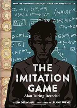 This cover is for the Imitation game. I think that this design is very effective because it tells the story of the book. The Imitation game is based on a true story of the British mathematician Alan Turing building the first ever computer with artificial intelligence to help his allies beat the Nazis. The book cover shows his calculations and bits of the machine itself to the left. On the front of the page in the central point of focus it shows an animated Alan Turing with a serious face which shows the reader that he is a strong thinker. The title is also well placed on his chest where the is little colour so it is very easy to read.
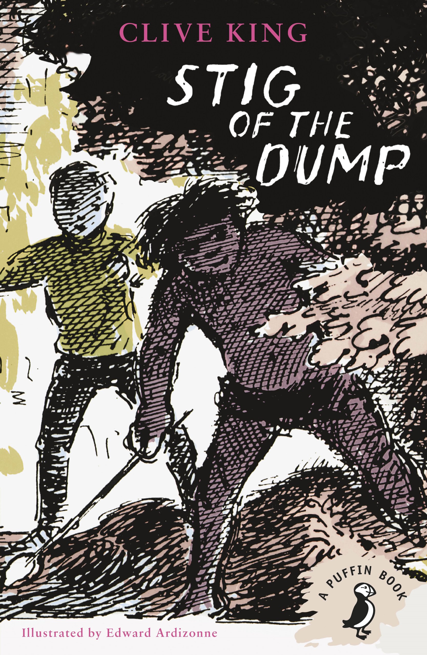
Stig of the Dump has a very good cover. It shows to two main characters Barney and Stig where they meet in the chalk cave by the rubbish dump. The cover shows both of them together on an adventure. The majority of this cover is graphical and shows the characters and there location I think that this effective because it shows the story of the book.
The book title and authors name have been cleverly placed at the top of the book where the shadow is shown from the illustration.
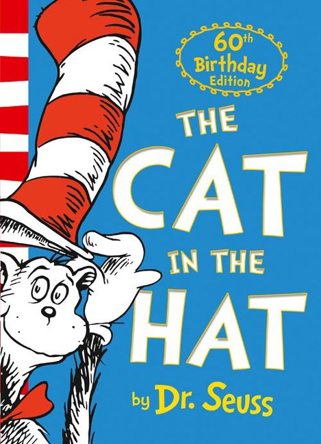
The Cat in the Hat is one of Dr. Suess’s most famous children books. It was written to appeal to many different children of many different generations. The cover looks very friendly and is therefore appealing to that target market.
The title is written in a very large text so is easy to spot and is also useful for children who are learning to read. The left of the cover shows a drawing of the cat in the hat, here he looks very friendly and appealing to a younger audience.

The last Wish is a book made from the same writers and creators of the Wicther which has gone on to be a very successful game series.
The last wish is a book mystical adventure and fantasy. It is set many years ago.
This story line is shown in the book cover by the way it has been designed to look old and rustic. The cover looks like it hundreds of years old and like the book hides many secrets. The silver text also works very well on this cover as it stands out from the background and is very easy to read.

The Twits is another classic by Roald Dahl. This book is about a Husband and Wife who have gone onto hate each other and constantly play horrible pranks on each other. In the book Roald Dahl describes them to be very ugly and unapproachable which Quentin Blake has illustrated very well on the cover. Many other aspects of the book are also shown on the cover. If you look closely at Mr Twit it shows all the old food on his beard which was described in the book. As well as this the birds and the glue used to trap them is shown in the cover. On the bottom right of the cover there caged monkeys are also shown.
I like the design of this cover because it also shows the title of the book very well, it is shown in its own banner and is therefore very clear and eye-catching. Roald Daul’s name is also shown in large characters across the left hand side making it clear that he is the author of this book.
Typography Research
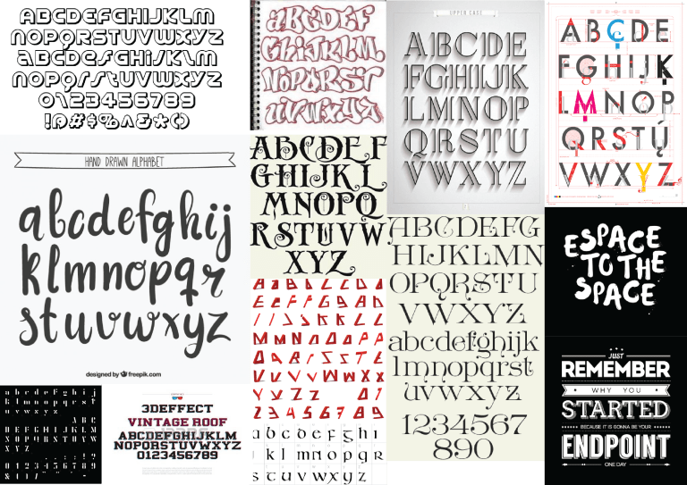
Here I have researched different types of typography
Moodboard:
I have created a moodboard with many different books that I have read and feel inspired by. By making a moodboard with all these books I am able to compare all the different cover designs to the ones that are most appealing to me. I can also use these to help influence my final design.
Completed Design Ideas (P2 M2 D2, P3 M3 D3)
In unit 42 we are required to design and publish book covers for two books of our choice. The purpose of this unit is to show that we can design a product efficient and make all the relevant information fit into the correct place. For example a book cover can be quite difficult to design because the design has to look consistent in every area of the cover but still work as an effective book cover that shows the right information in the right places. Designing the front, spin and back to look all fit into each other can be challenging.
As I previously mentioned we are required to design two book covers. One most be designed to show mostly graphic and must be quite artistic and the other must gets its message across using mostly text.
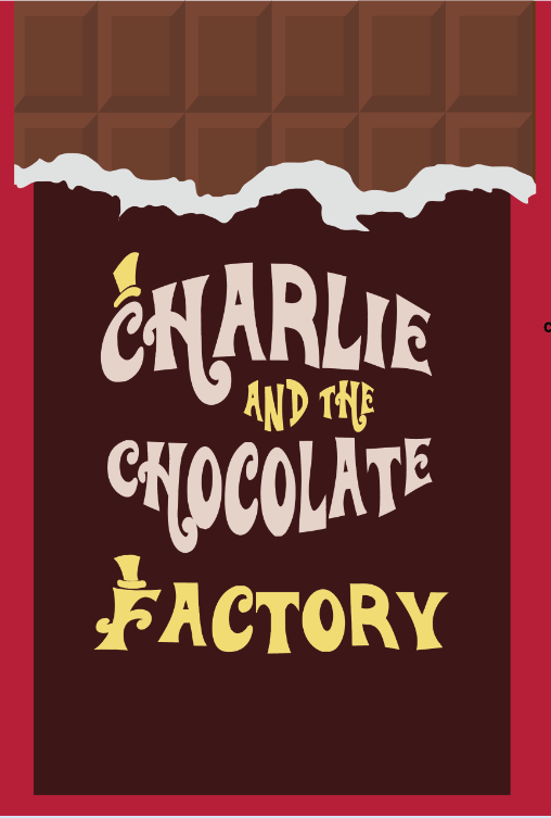
For my typographic book cover I have decided to do Roald Dahl’s Charlie and Chocolate Factory. I think that using this book as my typographic book cover will be effective because I can design the book cover to look like a chocolate bar and the text and the title can be a replacement for the branding. Chocolate bars are always covered in texts and branding so I don’t think that it will be to difficult to change it to make it the title and blurb of Charlie and the Chocolate factory. Designing this book to look like a chocolate bar is also a good idea because the book is mainly about chocolate and Willy Wonka’s Wonka Bars. By making the book look like a Wonka Bar it is fitting in with the theme of the story and giving the reader a clue of what the book is about. It will also help them picture what a Wonka Bar may look like when they read the book.
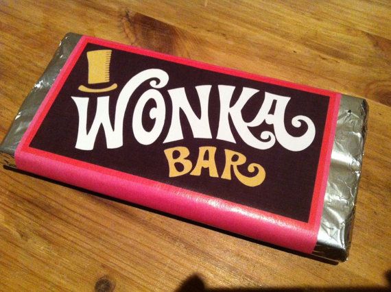
This is what the Wonka Bars look like in the film and on some real live parodys. The design on all Wonka Bars seem to have a red border with a brown cover. I will try to use this design on my book cover as much as I can. One thing that I will have to change is that I will have to design it in a portrait orientation this is because books are read in this position and will be the expected design this may become challenging because all chocolates bars are designed in a landscape orientation. I do believe that this is a very effective design and I will be using to inspire me when designing my book cover.
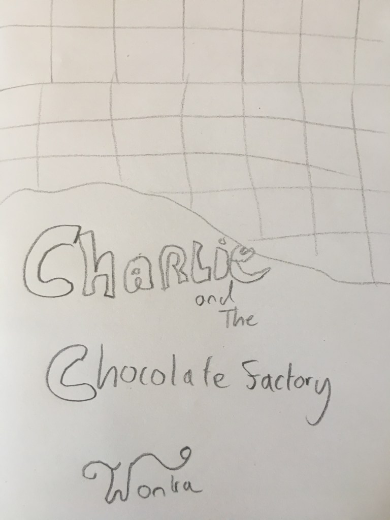
This is a very basic sketch that I made to help me get an idea of how I will design it. When making the actual cover on Illustrator and Photoshop I will refer back to this and Wonka bar and use both of them to help influence my design. As you can see on my sketch I will make it look like part of the wrapper has been ripped of and draw bits of chocolate to help give the effect that it is a real chocolate bar.
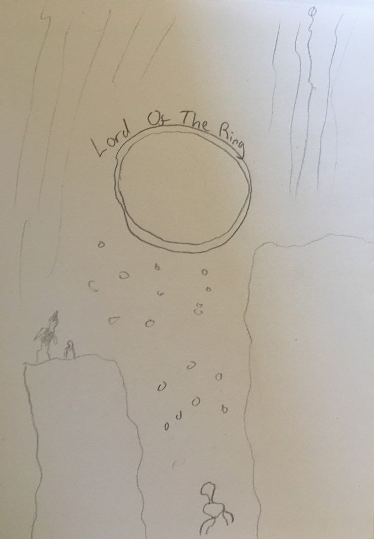
For my Graphical book cover I have decided to do the second Lord of the Rings book, The Two Towers. I think that this is a good choice because it is a such a large book with many scenes and events. Because there is so much going on there are so many different things that I could choose to use a book cover. As this will be a graphical cover I am likely to draw different characters from the book as well as famous places in the book to use as backgrounds.
I currently have two designs in mind one which I have sketched above. Which shows Frodo and Gandalf walking through a collapsing cave with Gollum at the bottom trying to find his ‘precious’. I think that this is a good design because it shows some of the main characters in a very important part of the book. There is also a lot going and a lot to draw which is important as this cover is designed to be very graphical.
The second design (which I have not sketched) is an image of an Ent walking though a misty forest. I also think that this is a good idea because it is a key part of the book and will show the reader that the book is a about adventure and fantasy.
Final book cover designs (P2 M2 D2, P3 M3 D3)
Charlie and the Chocolate Factory
Here I have several screen shots of my work while designing my cover. I think that these are very useful because they show how designed each part of my cover.


The Chocolate was actually very easy to design. On Illustrator a selected a chocolate brown colour and made a square then around it a created blocks to give it a 3D effect. Once I put all these together it started to look like a solid block of chocolate shown on the right. Once I created this I just duplicated it dozens of times, placed them next to each other to make it look a solid chocolate bar shown below.
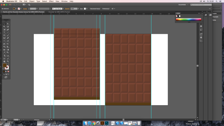
Then I hand draw a tare and scanned it onto the computer to make the wrapper that I will later place on top of the chocolate.
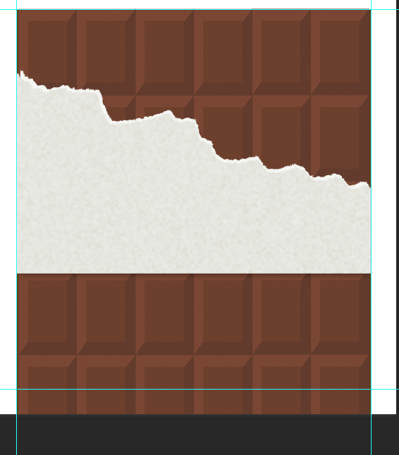
I then worked on this a lot. I changed the colour to red and placed it on top of most the chocolate. I then placed text on top of it and began to brand it.
This is what the finished front cover now looks like. After this I went onto design the Spin and back cover, (shown below).

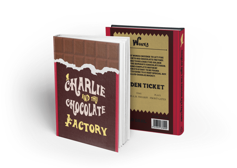
This is the book cover placed on a computerized mock-up. I did this using a premade book template on Adobe Photoshop. I think that It is important to place it on a digital mock up before printing so I’m able to see what it looks and decide of any changes need doing before printing. After creating and looking through this mock up I was satisfied that it works well on a book and was ready to print it and place it on a real cardboard mock up
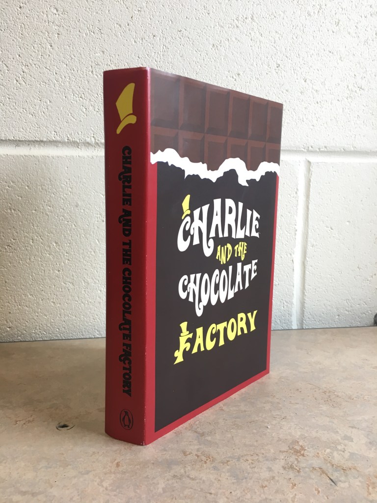
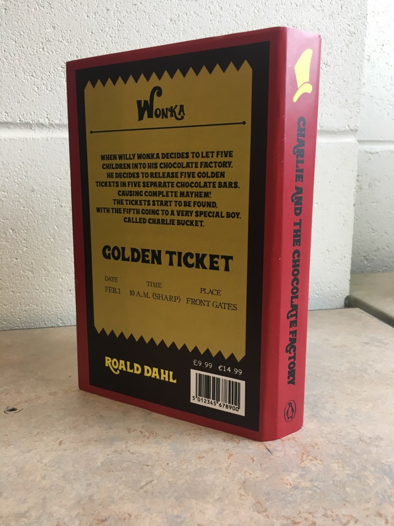
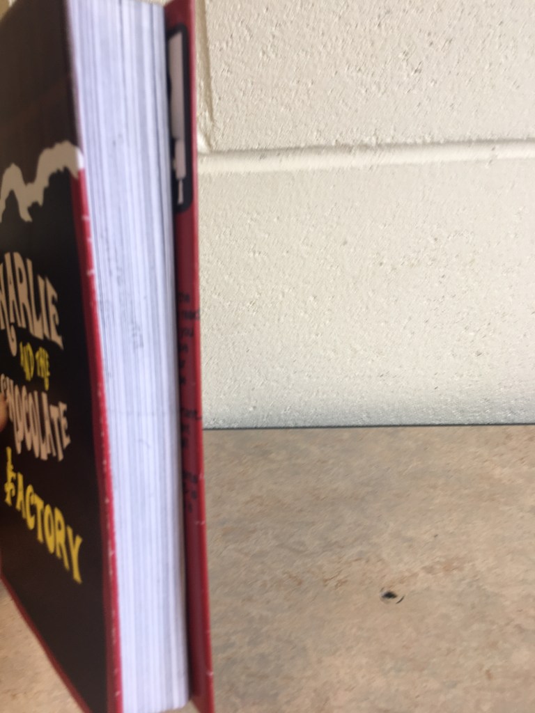
This is the finished result that I printed and placed on a cardboard mock-up which I made. This took me a few hours to make as I had to make sure all the measurements were precise. It is very good to see it in real form as it looks like a real book cover. By printing it and placing it on a real mock up I know for sure that all the measurements are correct and that it works effectively and all the important information and graphics are shown.
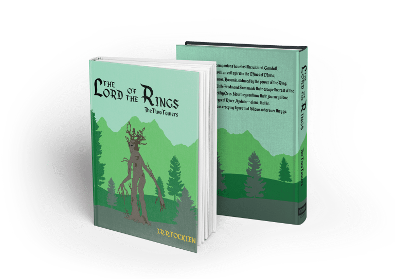
Lord of the Rings: The Two Towers
The Two Towers is my graphical design which is designed to show the reader what the book is about using graphics and art. In the end I decided to create the cover to show an image of an Ent walking through a misty forest. This is a good design because it shows the reader that lord of the rings is a mystical-fantasy story. When designing this cover I took several screen shots of my progress to show how a developed it before creating my final piece.
The first thing I did was design the mountains in the background. I did this by drawing a wavy line by hand. I then scanned this and inserted it into illustrator where I then ‘live traced’ it to make it a vector which I could edit and add color to.

")
After designing this I added this to the book cover on illustrator and began to draw other hills and trees using the pen tool.
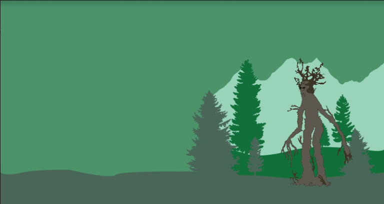
Designing the Ent:
The Ent was acherally very hard to draw and took the up most the time when designing this cover. The Ent shown here is inspired by the ones shown in the film. I designed this by tracing the basic outline of the real thing by hand. Once I had done that I scanned it and spent hours editing it in both Photoshop and Illustrator until I got a final result that I was happy with.


")


After I was happy with the final result of the Ent I added to the front page of the book between all the trees to look like it is walking through the Forrest.
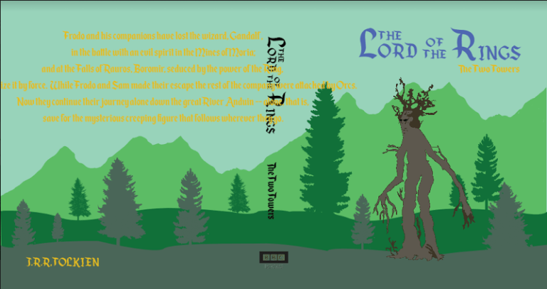
Here I had created the basic design of the cover and the only things that need changing are the colours text and text size.
This is the finished design that I had created. Overall I am happy with it and am ready to publish it onto a book mock-up using Photoshop.
This is the book cover placed on a computerized mock-up. I did this using a premade book template on Adobe Photoshop. I think that It is important to place it on a digital mock up before printing so I’m able to see what it looks and decide of any changes need doing before printing. After creating and looking through this mock up I was satisfied that it works well on a book and will be happy to print it on a real cardboard mock-up.
Design Report:
Charlie and the Chocolate Factory


This is the finished result of the Charlie and the Chocolate Factory book cover. I am genually very proud of this design and think that it works very well and has a good design. I have designed it to like a real Wonka bar, but instead of having normal Chocolate Branding I have put on the book title and a blurb. Luckily I was able to find a font on dafont.com called ‘WillyWonka’ which was designed to look just like the text on a real Wonka Bar. This helped me a lot when designing the cover because it makes the design look like the real thing and helps me make the cover look consistent throughout.
On the front of the cover I made it look like a Wonka Chocolate Bar which helps people know the book is mainly about Chocolate. On the back cover I put the blurb on a golden ticket which I made using the pen tool. I think that this was a good idea because the golden tickets are another important part of the book. As I mentioned early I also printed this cover and put it on a real cardboard mock-up to make sure the measurements were correct and as an effort to reach the distinction criteria.
Lord of the Rings, The Two Towers
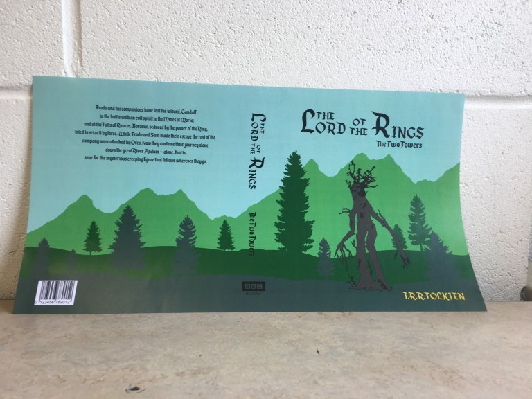
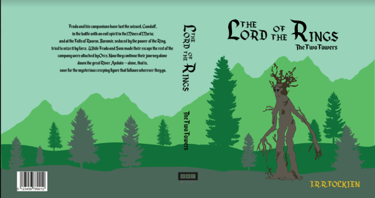
This is the finished result of my Lord of the Rings cover. I also think that this is a very effective cover. It shows a key part of the story line. I have designed this cover to be like one large image instead of having each part separate. This gives the effect that the Forrest is very large and goes on for a long time. This also shows that there is a lot going on with a lot of mystery in the book.
I have put the title and the blurb of the book in the sky with a clear background so it can be easily read and can stand out. I have also carefully chosen font the look mystical to make sure that it fits in well with the theme of the book. As well as this I have also added the authors name (T.R.RTOLKIEN), The publisher (BBC BOOKS) and a bar code. I think that all of these are important because all books have them and helps give it a realistic effect. Although I put this cover on a digital mock-up I did not fit on an physical one as it was unnecessary for the criteria and I knew that the measurements work because it fitted perfectly on the computerized one.
