Research Activity 1:
To start of this unit I was required to conduct different types of research so I can fully understand how clothing brands work. By doing this research I could see what works well within fashion and what doesn’t. Then with this information I can begin to create my own brand.
Show 10 examples of brand identities:
![]()
Why are Vans so successful?
I believe that there are many reasons for Vans success. After researching the brand I came across a YouTube video called ‘Vans Behind the Brand’. I learnt that when they first started they had only targeted there shoes towards the skater market. However each of these shoes had different designs which appealed to different people interested into different sports. Some of their original lines attracted Surfers, BMX riders, and skaters. The video explained that they did not market it this way and this market formed itself by a very appealing logo design, company effects and the overall design & quality of the product.
After researching logos and companies in general I also learned that logos are not everything to lead to a businesses success.
Although a good logo is a very important asset towards a businesses success it is not everything. The Vans logo is very appealing because it has bold, simple and rememorable type inside the shape of a skateboard which makes it clear that there target market is towards skaters.
After that logo was designed Vans would have invested millions of dollars in advertising their brand and logo. After this logo was designed Vans would have invested huge amounts of their budgets into marketing campaigns. Including; TV, Radio, Bill Board / Bus Stop, Posters, social media and public sponsors and campaigns. Events like this also explain why Vans and there logo is so successful. If Vans did not invest millions into their marketing campaign them and their logo will be no where near as big as it is today. It is for this reason that Graphic Designers are not 100% responsible for an effective logo.
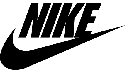
Nike is another brand that we studied as a class. Nike is one of the biggest and most recognized sport clothing makers. There logo of a simple tick is instantly recognized by everyone as Nike. This is mainly due to the simplicity of the logo. Only having one colour and one component it is easy to remember and draw. On some of Nike’s products the company name ‘NIKE’ is also written next to their logo in black, bold & Italic text. This type fits in well with the logo and also reminds consumers of the company’s name.
As I previously explained the design of a logo isn’t the only reason why a brand is successful. Nike is one of the world’s biggest clothing companies and is famously known for huge marketing campaigns throughout their history. It is because of this consistent marketing that they are so successful. On every world cup nike is a sponsor and show long advertisements in half time. The football is often made by nike as well as the clothing worn by the footballers. The world’s cup is just one example of their marketing techniques. They also sponsor in many other huge events. They can also be seen in TV, radio, magazine, billboard, bus stop and social media advertisements.
IN the class research I learnt the Nike logo was designed by a graphic design student named Carolyn Davidson in 1971. She was paid $35 ($206 in today’s standards). When anyone first here’s this they ultimately think that Nike ripped off Carolyn Davidson. However this was before Nike was worth $26 billion dollars and before they knew how big they’d become. As I previously mentioned Nike has also invested Millions in advertising to grow their logo and brand. Years later Nike also offered Carolyn Davidson a life supply of there products free of charge.
![]()
Ralph Lauren is very different to some of the other brands that I studied and have different reasons for their success. Unlike many other clothing brands there logo is much more complicated. The logo shows a jockey riding a horse. Ralph Lauren is a very expensive and premium clothing brand with their cheapest shirt on sale at £75. This shows that Ralph Lauren is targeted towards the more wealthy. Horse riding is a sport that is often played and watched by richer people. This is why I think that Ralph Lauren have made a good logo because it is appealing to their target market.
Another reason to why Ralph Lauren is so successful is because they have kept all of their products consistent over time. Throughout their history they have always been a luxury brand offering quality products to their customers. This consistency is a key reason why there brand is strong. Because of this they are instantly recognised as a high end brand selling great quality products.
Ralph Lauren’s logo is very well recognized because it is printed on the right hand side of all there shirts. By doing this they are advertising their brand on their customers, this is because the logo will be seen by millions on people’s shirts. I think that this Ralph Lauren’s main source of advertising because they rarely use mainstream advertising techniques that other brands use.
![]()
Hollister is another example on how the most simple logos can be the most effective. The hollister logo is just a simple bird. It only contains one colour and is very simplistic. Any level graphic designer could have easily designed it, by simply using the pen tool on illustrator. Despite the simplicity of this logo Hollister have still put a lot of investment into their brand. Hollister is well known for being a unique company which stands out from all other clothing companies. The first example of this is how all their stores have a unique and vintage design. Rather than a normal window and sign, Hollister stores have a design of a vintage california shop where the front if made of wood and sticks out on the street, the stores are also very dark inside. (All of the lighting is from stage lights focused on their clothing) . All of the staff also have to be models and in their american stores male staff are often expected to work with the shirt of. This is a reason why there logo is strong and recognized because it belongs to such a unique company. Like Ralph Lauren, Hollister rarely does TV & Billboard advertisements. Instead there logo will be printed on the right hand side of there clothing where the public can see it on each other. Hollister is also a very upmarket brand which is targeted towards younger people. Hollister’s brand is proven to be reliable because there products are of high quality and price.

Element is a brand which is very similar to Vans. They to have a hipster vibe and target their products to skaters. Like Vans Element products are purchased by a large variety of people and not just skateboarders. Their business structure is very similar to Vans in the way that they market and advertise there products.
The logo itself has a very good and simple design using only one color. By looking at the logo I can see that there are many different layers which may have been difficult to originally design. The design has to circles and a tree shape inside it which looks simple and is easy to recognize, but still shows the consumer that effort has been put into it. The bold text saying ‘Element also fits in very well with the logo’. The logo has also been designed so that it will look good on different areas of the products. It can be presented in many different colors, sizes and materials and still look very good. I think that this is a very important when designing a logo. A graphic design most always think about how the logo can be used in different sizes and spaces when creating it, because when on clothing items it will always be put on different materials at different sizes.

Cedar Wood Stater is a clothing brand owned by the budget clothing retailer Primark. Primark is well known for selling ultra cheap clothing for prices as low as £3.00. By creating a clothing line within their store Primark make their products more valuable to a consumer. I think that Cedar Wood State has a effective logo because it is made only of type which means people can read it and understand what the brand is without the read of remembering a logo. It looks very like it was very easy to make (being only text with splatter vectors inside it). Unlike all the others logos on this blog the marketing of Cedar Wood State is not very strong and subsequently they are not an instantly recognized clothing line. Being exclusive to Primark little money has been spent in advertising and marketing this brand. The logo is also missing a symbol which the majority if successful logos have.
The Cedar Wood State logo is often proudly displayed in Primark stores but no where else. It is also often hidden on there products which shows this logo has not been designed for huge publicity. As mentioned above this is a cheap, low quality brand so it makes sense that little money has been invested in marketing the logo.
![]()
Louis Vuitton is an example of a very high end brand which is only within the budget of the rich and elite. The majority of their products are designed with the highest quality / rare material and are often purchased for the customers to make a statement of their wealth. For example they are currently selling an iPhone 7 Plus case for $5500. There most expensive product (Steiff Louis Vuitton Teddy Bear), sells for 2.1 million dollars!
It is for these reasons that brand identity is very important to Louis Vuitton it is very important to them that all the products are of exceptional quality and high prices. To prevent the value of their brand dropping they will destroy all of their unsold stock by burning it to stop it for selling cheap online. They also reflex their luxurious brand in there logo. There logo is designed so the L and V overlap each other to make it seem like one character. Both of these characters are also in serif style fonts which appeals more to wealthy consumers. As well as this they also have their full name written underneath the logo to ensure that they are recognized and remembered. This is written in a plane and clear font which is simple and easy to remember.
![]()
![]()
Adidas is a very well known German sport clothing brand. They are known to make many athletic clothing and shoes as well as trendy social clothing. Like many other clothing brands mentioned in this report Adidas has their name clearly written underneath there logo. It appears like this on the majority of their products. This is good because it helps people associate these two logos with the brand. The logos themselves have been very well designed; they are clear, simple, easy to remember and draw out. However my favorite things about these logo’s is that they can work effectively with all sorts of different colours and designs within them. The Adidas logo does often appear in black or white but does have very creative designs in some of their products. Even with all these different designs the logo still works very well at different sizes. With all of these different designs Adidas is able to appeal to all kinds of different people with different tastes, this makes their brand identity very wide and recognized by a large amount of the population.
![]()
Karrimor is a well known British outdoor clothing company. Rather than trendy clothing (like most other brands in this list), they specialize in in running and camping gear. All of there cloths are very high quality and are designed to survive in the most hostile of conditions. They are often used by mountain climbers who need strong, comfortable and practical clothing. It is very important they are recognized as a reliable brand that can hold up in these situations. Karrimor have done this very well by releasing only fully reliable products because of this there brand and logo is now associate with great quality items. There logo is also a very good design. It has been based of the union jack which is already recognizable and associate with rainy weather which karrimor as a brand tackles. They have also only used two colors (black and white) which makes it very simple and eye grabbing.
![]()
Jack Wills is another example of a relative high end fashion brand. There logo has a very traditional English style to it which makes it feel very luxurious and posh. Unlike most other clothing companies there logo only contains text and no symbols. This is usually a bad idea because people are most likely to recognize a simple logo design instead of a load of text. However Jack Wills is still recognized by the majority of the public. There slogan is ‘Fabulously British’ which shows that they are proud to be British as a brand, this pride will also reflex to their target market which will make them noticed by them.
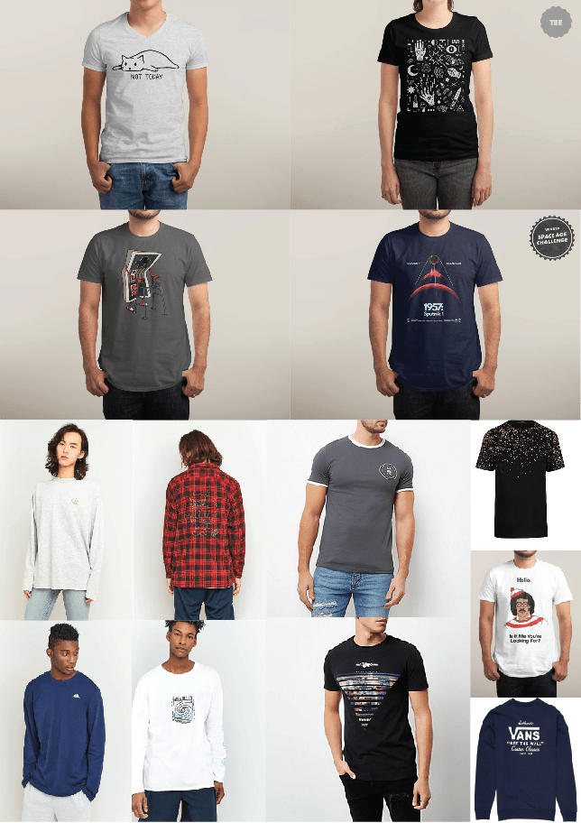
Show 6 examples of clothing designs:

This is a good example of a colourful picture shirt which has been designed and sold by Paul & Bear. I think that this is a good example of what you can with shirt. They have designed a very colourful picture and placed it in the middle of the shirt where it is most likely to be seen. I also like the way that the designer has made one half of the image black and white and the other colourful, I think that this is a design which is seen on many different shirts and has proven to be very effective. I am very likely to have a design very similar to this on my clothing line.

This is an example of a more basic design by Adidas. However it is still appealing to some people within the re target market. It clearly displays the Adidas logo on the left of the shirt and has strips in three different colours which makes it more interesting. Although this is a bit of a dull design it is still important to have basic designs which just showcase the logo, this is because it grows the brands identity and makes more people aware of the brand Adidas.

This trainer designed by Nike is an example on how one product can hold many different colours and still look very good and appealing to some customers. It has been made with a gradient between orange and pink. These two colours seem to go very well together and look good on this trainer. Most shoe designs are very plan with one colour and therefore are not highly noticed. By having bright colours on the shoe people are more likely to notice the shoe and the white Nike logo which stands out against it background.
 I think Levis is a great example of a brand which takes good use of brand identity in its clothing designs. Levis is most famous for being one of the world’s leading denim manufacturers. With 144 years of selling jeans there designs are known to be of exceptional quality which will last a lifetime. Another part of Levi’s successful design is that all of there jeans are instantly recognized by the brown tag on the top right of the jeans. As well as this all Levis products also come with a red label containing their logo. By including these simple extras on their designs they are promoting their brand and reminding people that they made the quality product.

Vans is famous for there there great design. All of the unisex shoes follow exactly the same design. These were originally designed to be appealing towards skaters, however this design had grown beyond its target market and appeals to a much larger portion of the public. I think that this is mainly due to its consistent design which is the same for all of its shoes whether they’re male or female designs. On all of their shoes there logo always appears at the back and on the side of the shoe. This is an important part of the design because it helps people recognize that it is made vans therefore improving their brand identity. Vans also produce many T shirts with there logo on it this is a good design that also promotes their brand. 
 Super Dry is a brand which is known for using the vintage look on the majority of their products. As well as super dry many other clothing companies also go for a vintage design. This type of design appeals to hipsters and more trendy people. Fashion designers often create the vintage look by using traditional looking typography. This design is also achieved by putting splatter vectors on top of this text to give the text a more rustic look. When this kind of design first came out it was very popular because it was a new thing that had never been done before, however it is now starting to be over used and is becoming less popular.
Show 6 examples of clothing tags, bags and packaging:
Clothing tags come in many different forms depending on the product, where you bought it from and its price range. This tag is from one Paul & Bear denim lines. Like the majority of clothing tags from trendy stores it has quite a rustic look. They have only used three colours (Red, Blue and White). I think that this is good because it doesn’t over complicate the tag, but still gives it a good and appealing design. This tag also has vectors included on it which appeals to their target market.
Rather than being held onto the item of clothing by plastic it is tied on by a piece of brown string. This fits in with the design of the tag very well.

Whenever you order from asos.com your items of clothing always arrives in this pre-sealed bag. I think that this is a good design because it looks a lot like a typical shopping bag but it has been well designed so it works effectively for delivery. It’s black and white design works very well with the brand because it matches well with all sorts of different clothing which might appear in the bag. The overall design is very basic but has a good point of focus on there logo. Underneath the logo there are also icons with all the social media sites they are on. I think that this is effective because it adds to the design and tells the consumer where they can contact asos.

Primark is another example of a clothing company that has designed there bags very well. The overall look of them is very basic, however with the plane brown background the primark logo itself stands out a lot and makes it more noticeable for people to see it.
Another thing that makes people favor the Primark bag is that they make them out of recycled cardboard boxes. This is makes them more environmentally friendly because they have already been recycled but can be recycled again by the consumer. Recycling is currently very popular with the public so brands that recycle are therefore favored by their target market.
This label is from a plain polo shirt with typography around it. The design of the shirt looks very luxury but doesn’t include much text or detail. I think that this label reflects that very well. All this label seems to show is the company’s name and its logo on a plain white background. This plain label goes very well with the shirt design and keeps the branding of the product very consistent and appealing to the target market.

Hollister is very well known for running their stores and marketing their products differently to the majority of other clothing retailers. As I mentioned earlier all of there stores have low lighting with stage lights focusing on certain products.
As well as this the bags are another way that Hollister is different to the majority of its competitors. Rather than having plain bags they tend to have pictures of their models on their bags. This is good because it makes the bag stand out and more eye grabbing. Once a person has noticed the picture they’ll then see Hollister’s name and the bottom which will improve their brand identity.
 Nike has this shoe box design for most of their trainers. I think that this a good design because there logo covers the entire box which makes it very noticeable as a Nike product. Many Nike shoes have very different designs which might not work certain boxes, it is also very costly to design a new box per shoe. So having one plain design which will work with most shoes is a very good and cost effective idea.
Stationary Sets:
 I quite like this design as it seems to be very consistent. This company has designed many different items for their stationary set, each one uses the same colors and basic design. This is very good because it keeps it minimalistic and allows each person to remember the company. The design of three colors is very simple and eye grabbing. It is looks like it was very easy to design as well, which means it can easily be updated or changed.
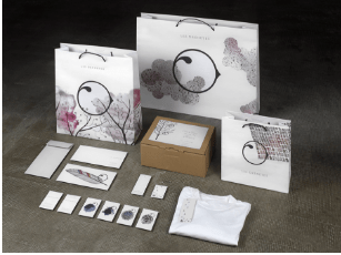
Unlike the first stationary set this one appears to be much more complicated. Although there is a rule in branding to keep things simple, I still think that these products have come out very well. This stationary set belongs to a french clothing company ‘Les Orenetes’. The design of their logo itself is still very simple being a circle shaped like a bird. What gives this product a more complicated and luxury feel is the pictures of trees and blossom across the products. Some of their business cards only persist of their logo and a feather which is very eye grabbing and memorable.
At first site I like the look of this stationary set. This is because there items only hold their logo and everything else is the relevant information to the company. I think that this is good because it does not overwhelm people and allows them to look into the company themselves and remember there logo.
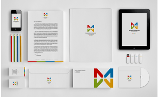
However I feel that the design of this logo is to similar to the modern Microsoft logo. Like this the Microsoft logo is made of the same 4 colors and has a square design. This logo has been changed slightly as the Colors are on opposite sides of the square. Rather than using 4 other squares to make the big square they have used triangles. Despite these minor changed I still think that this logo is to similar to Microsoft’s and think that it has been plagiarized.

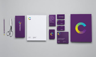 I quite like this design as the bright logo is very well reflexed on the dark purple background. This logo Belongs to a company called ‘Creavisa’ and the logo is a C for there brand. This logo has many different colours inside which creates a very good effect for the logo.
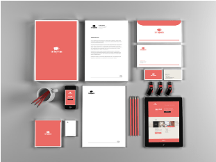
Like many of the other stationary sets featured this one has a very simple and
effective design. The light red background allows the white text to be very visible. The light red also allows a very effective theme to be shown across the stationary set.

This stationary set is very similar to many of the previous ones. It to has a very good and consistent theme. Using only two colors it is very eye catching. The white text is very visible on the blue background.
I also like the way that they have included an iPad and an iPhone 4 in their station set. This is good because it shows what their logo will look like on a HD display.
Themeboard Activity 2:
This is a themeboard that I created to show other graphic and image styles. All of these designs are quite simple yet very effective. After carrying out all of this research I have deiced that I am going to make my brand look similar to some of the designs features on this themeboard.
 hst
hst
Final Clothing Logo design:
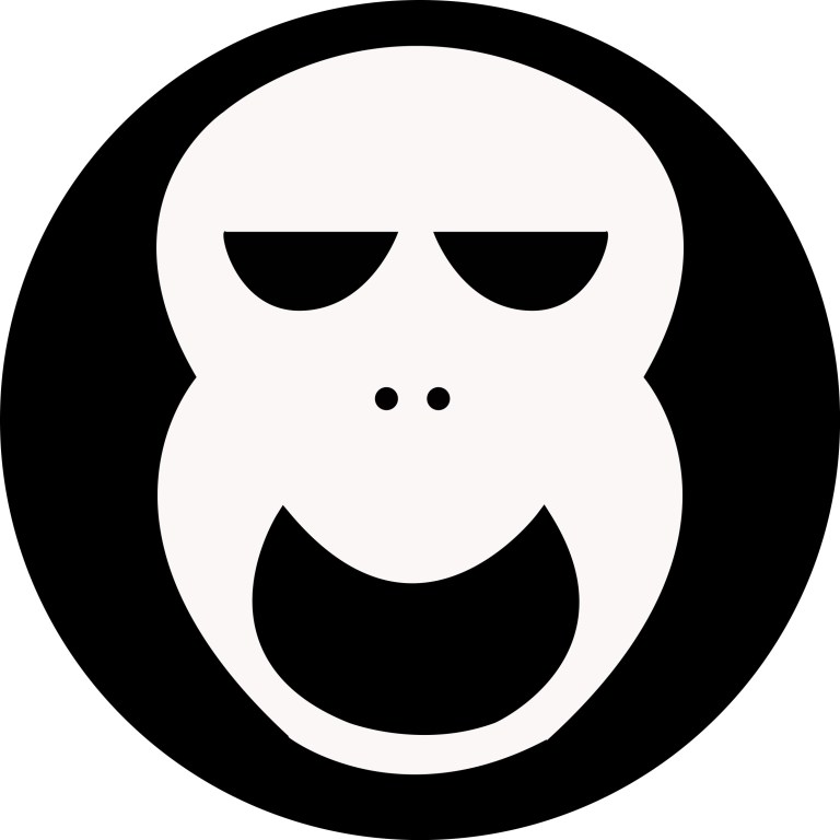
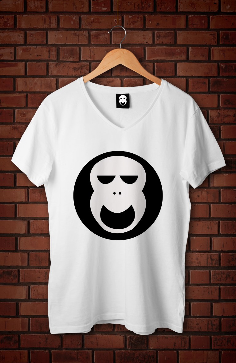
This is my final design for my clothing logo. Although this design is different to what I had originally planned I think that it works well with my clothing brand. I decided to change the logo mainly because I had bad feedback from the class on the original design. When designing a product I feel like it is very important to listen to peoples comments and use them to improve the final product. This logo is supposed to show friendly gorilla skull, which appeals to the younger hipster market. I Have decided to name my clothing brand ‘appy skull. I think that this name fits in very well with the logo and will appeal to my target market. This logo was made on Adobe illustrator. I have also made it into a psd file so I can photoshop it on several stationary sets and shirt mock-ups. (My original design was shown below).

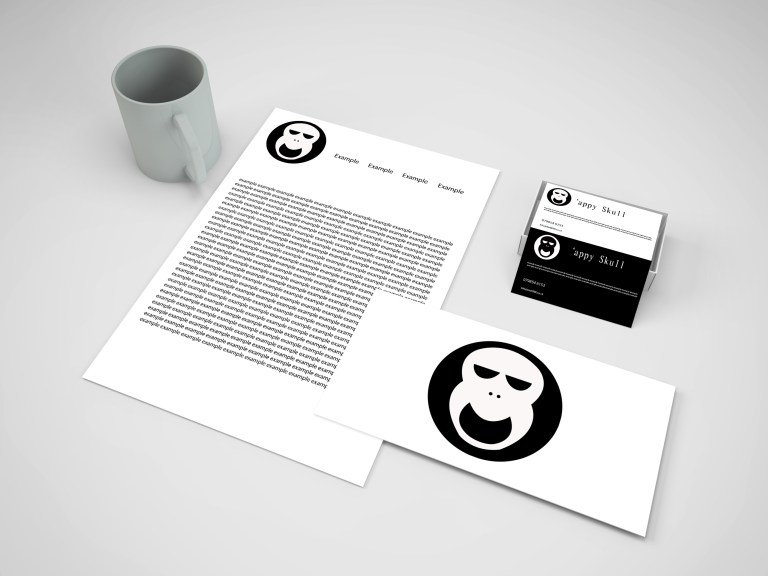
Here is my clothing brand on stationary set. This stationary set includes a letter. a envelope and both sides of a business card. A found this stationary set on 365websourses.com. I choose to use this stationary set because it has a very good design and was available for a free download.
Design Report:
After designing and researching many different clothing logos I decided to use the skull as my final design. I think that this is the best design because it was very simple. By making the design simple it easy for people to recognise as a brand. This means that it will have good brand identity and people will instantly recognise it as a brand when its on any clothing product. I also designed so it would fit onto any background easily and work on many different items of clothing and there designs. I designed the logo to have a smiling face and closed eyes to make him look friendly and approachable. By doing this it should appeal to a younger market. I also have only used to colours to keep it simple and not over complicate it. By keeping this design that simple it can be effective at many different sizes on many different products.


