
Within Unit 3 we were required to create a poster for a horror film or series of our choice. I Choose to do the AMC series The Walking Dead. I think that this was a good decision because it has 7 different seasons with many recognizable events and scene. This means that making a poster for The Walking Dead would be very effective because it is recognised by many people.
Task 1 – (P1, P2, P3)
Research the Horror Movie Genre. Do this by reaching movie posters and annotate what you think its strengths and weaknesses are. Show why the colouring, fonts and styles are effective.

The Women In Black
I have chosen The Woman In Black as my first example of a horror poster design. I think that the design of this poster is very effective and appealing to the audience because it has been made with dark colours. This poster has used many of the same colours just in different shades. This keeps the design basic but mysterious. The front of the cover shows Danial Radcliffe (One of the main characters). Getting watched by the Woman In Black. In the film the Woman In Black would sneak up on her victims without them knowing before haunting them. This is clearly shown in the poster which means it is very effective.

Unfriended
As most other horror film posters, Unfriended has used dark colours in there poster. I think that this is good because it demonstrates. Mystery and fear. The film Unfriended is set over Facebook and on computers, I think that this is well shown because actors face is lit up from the screen of a laptop, She also has earphones in which suggests that she is using a computer.
Sinister
This poster is very well designed. It clearly shows that the girl is possessed
 by a demon. This is shown by the way that she is walking along with a knife dragging against the wall. As the wall bleeds you can see the face of a demon made out of blood. Although this poster is plain and shows few objects it still demonstrates a lot of what the film is about.

Night Of The Living Dead
I like the poster from the night of the living dead. This is because it has a very simple design yet its message is still very clearly shown. Its text has also been made in a Saul Bass style.
As well as the have pictures of the actors doing different scared poses.

The Purge
The Purge is a horror film with a difference. Unlike most other horror films there are no demons or ghosts; just a night where there is no law and everything is including murder is legal.
This is well shown in the movie title by the way that there are criminals in the street with weapons. A lot of the poster is contrasted with orangery colours which show fire.

Insidious
I also like the Insidious poster because dark colours have been used which show mystery and fear. The eyes of the main character have also been scratched out in the poster which makes him the point of focus it also shows that he may be possessed.
Task 2 (P1, P2, P3, M1, M2)
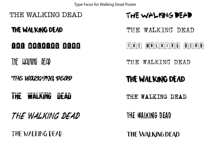
In task 2 to we had to go on sites like Dafont.com and find at least 15 fonts that could be used on my poster. Once we had found them online we had to download them and trail them in illustrator.
After trying all the 15 fonts shown below I choose to use the ‘Waterline’ font. I choose this font because I think it fits in with the theme of the poster and The Walking Dead very well. In the final design I decided to make the text blood red with other red splats around it. This reflex’s on the series very well because there is a lot of blood in the series.
Before choosing this font I considered 15 others and carefully decided that waterline was the most effective. Below are some other considered fonts.
Task 3 (P1, P2, P3, M1, M2)
Task 3 was producing our posters on illustrator.
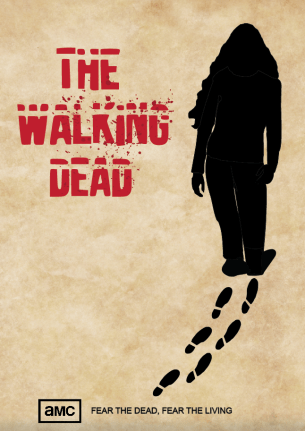
Above is the finished result of my horror themed poster, below are previous versions and drafts of the same poster.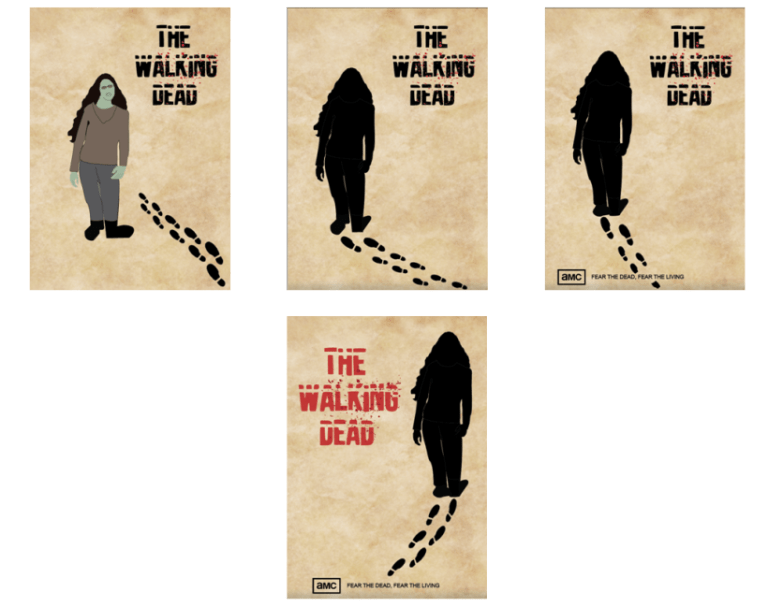
Hand Drawn drafts:
Before I made this final design on illustrator I made several hand-drawn drafts of what the poster could have looked like.
These are shown below…


HJGHJGHJGH
