Activity 1
Activity 1 required us to write two reports on logo’s. The first report will be five general logo designs. Here we will write what we think is good about them and why as well as this we will also write about hidden messages within in the logo and show whether they have any hidden meaning.
In the second report we will write a report which includes five logos which belong to a similar company to the one we have made our logos for. We will have to write how the logo fits in well with that company.
(I have written these reports in Google Slides. Please click on the links below to open them). https://docs.google.com/presentation/d/1T8f4sxu9O4Cd8E-Y5frna7KOuDSxrqt3EHfM2z0iitg/edit#slide=id.p
https://docs.google.com/presentation/d/1_JD7FMr3efa5SIdXOBd9s0sR_BO7tBIQYsnNB122XUM/edit#slide=id.p
Activity 2
Activity 3
Ideas & Concepts. Here we had to sketch out several designs for out logo and write down several potential names.

Activity 4, 5, 6 & 7
In this unit we were required to create a logo for a brand of our choice. I have decided to create my logo for a Graphic and Webdesign company. I have come up with the name of ‘Motion Design’. I think that this is a suited name because fits in well within the company. The word Motion describes movement and progress. By chosen this name customers should be able to see that Motion Design is a company that can effectively create a brand and a website quickly yet professionally.
To the left is the finished result of the Motion Design Logo.
It is Designed to look like it has been well drawn in one quick motion. This should show potential customers of motion design that they can create high quality Graphics quickly and efficiently.
As you can see have a decided to make the final result a dark blue colour with no other colours. I think that this is important because it is putting over 3 colours in a logo over complicates it and makes it harder for a consumer to remember. By using one colour the logo is very simplistic. and easy to be remembered. If there is to much going on it is less likely to catch someones attention.
This is a big difference from my original concept of the logo which was going to multicolored and contain every colour of the rainbow. The idea behind this was to show that Motion Design is a creative company which can create all kind of designs. However after lots of thought and colouring I had decided to give the logo a professional look with one colour throughout.
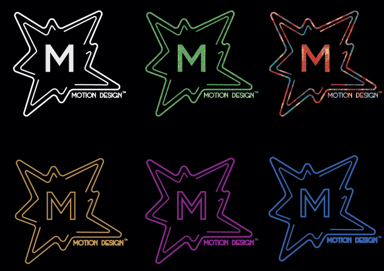
Unlike some other logo’s, Motion Designs logo includes text. At the bottom right of this Logo it says ‘Motion Design’. I think that it was important to add this to the logo so people can be clear on what the companies called. The word ‘Design’ is in this text which suggests that it is a graphic design company.
For this text I used the ‘ModernDeco’ font which I downloaded of dafont.com (http://www.dafont.com/search.php?q=moderndeco). I think that ModernDeco is a good font choice because it is very modern and fits in well with the logo and the branding.
Stationery Sets
As part of this unit we also has to create stationery sets for Motion Design.
Business Stationery Sets include business cards, letters, flyers, pencils and CDs.


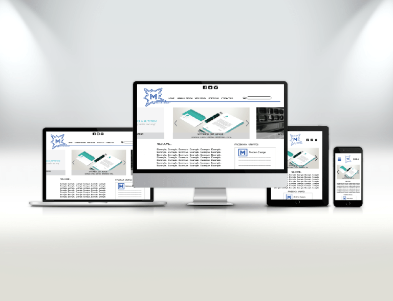
Website Template
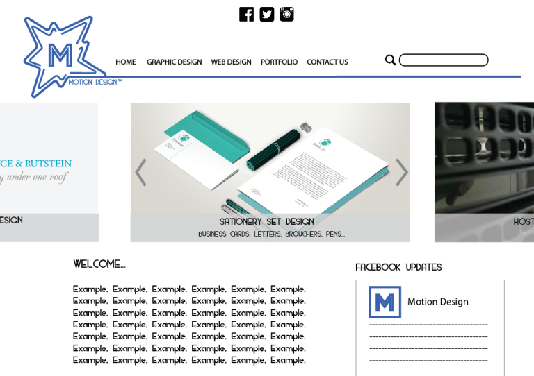
Within this unit we also had to design a website for a company. This is the final design that I have come up with. It includes vital parts that are expected in all good websites. This includes: links to social media, navigation bar, search bar, image slider, Facebook updates, company logo and text content.
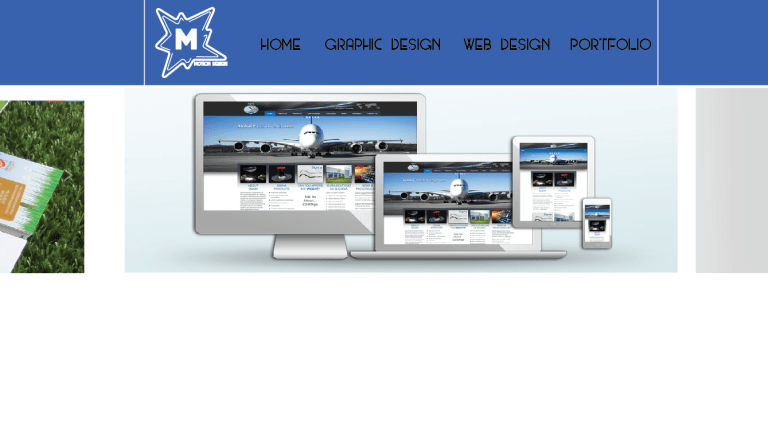
Before coming to this final design I had also completed other designs. However they did not turn out well so I have decided not use them. (Bellow is an example of a rejected design concept).


Hand Drawn Sketch of mobile website

Example of what the website would like on Desktop and Mobile devises.