Within this unit we were required to create 3 posters with famous quotes. As well as making these 3 posters we had to research different quotes which we may use in the posters.
To ensure that my posters are of good quality I researched many other posters on the internet and drew sckehes of possible designs by hand.
My Research:

I like this poster because it has quite a straight forward design but still has a clear message. The text is placed on a picture of an open road. This shows that your dreams can become a reality if you follow them well and make them into a plan.
Although thought has gone into this poster and its message it seems to lack originality. It has only used one type face which comes across as quite basic and plain. I think this poster would have been much more effective if the designer used different fonts and used them to tell a story within the quote.

This poster is much more creative than the previous one. This poster takes good advantage of its decorative typography to get the message of the quote across. Its white text is very bold and easy to read as its been put in-front of a dark background. With the front looking very old-school and a traditional blackboard looking background this poster has quite a vintage theme to it.
I think that this works very well because vintage themes are very in at the moment and will be likely to catch the attention of the posters target audience.
The text also starts of small and gradually gets bigger towards the end of the poster. This is good because highlights the keywords and then general message of the poster.

I think that this poster is very well designed and shows its message very well. This is an anti bullying poster which shows nasty curse words put together in the shape of a grenade.
The message in this poster is that ‘Words are weapons’, ‘They can kill’. Meaning that horrible words can build up in someone until they go of like a grenade and in severe situations could course suicide. I think that the grenade is a good metaphor for a victim of bullying. When seeing this poster a bully may think twice before using offensive language.
All the words have been clearly put together to make the shape of a grenade. This is a great example on how you can be creative with your text and make a good image out of it. Although the grenade is made out of nothing but text, the text is still very readable and easy to understand. Some of the key curse words have been put around the grenade. This is so the words can be read even easily it also adds more affect to the poster.
This poster also follows the rule of not using more than three colors. This is important because it makes the poster much easier to read and engage in. The red back ground allows the white and black text to be easily noticed and read.
My Chosen Quotes:
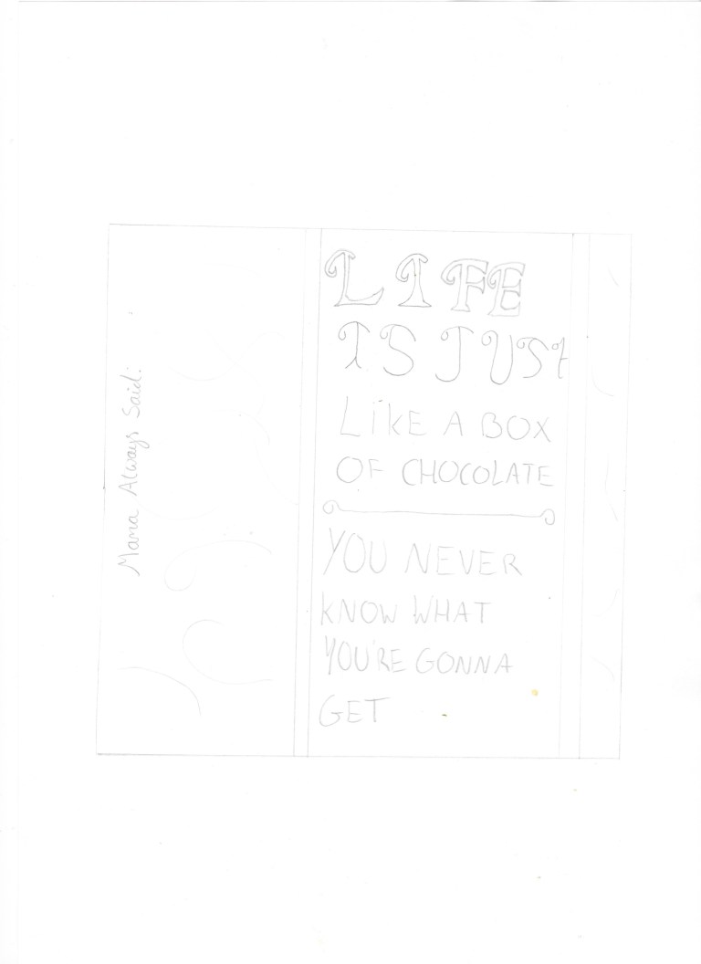
“Mama always said life is just like a box of Chocolate. You never know what your gonna get”
This is a famous quote from the Tom Hanks film Forrest Gump. It was said by Forrest Gump himself at the start of the movie. I think that this is a good quote to use because it is recognized by millions of people and allows me to get creative whilst designing it. My current idea is to design a box of chocolate on Illustrator and put the quote on the box instead of its normal branding.
“The 98% of people who do not follow their dreams, are employed by the 2% that do”
I think that this is a very good quote which has a lot of meaning behind it. This quote shows that everyone has hopes and dreams but only 2% of the population acherally follow through with them. The once that do often manage to start good businesses / organisations which would then employ the 98% of people who did not follow their dreams. The message of this quote is; in order to get to the top you must follow through with your dreams to reach the better 2%.
“Education is the most powerful weapon for changing the world”
This quote was said by Nelson Mandela. The message behind this quote is that to change the world you need to be intelligent and well educated. Using knowledge you can atchive many great things and guide other people. Without knowledge / education you will not know what you are talking about and people will not follow you meaning you will not be able to change the world.
“The future belongs to those who believe in the beauty of their dreams”
This was said by Eleanor Roosevelt, an American politician. This quote has a similar message the 98% one above.
The message in this quote is to follow your dreams and a good future will be yours.
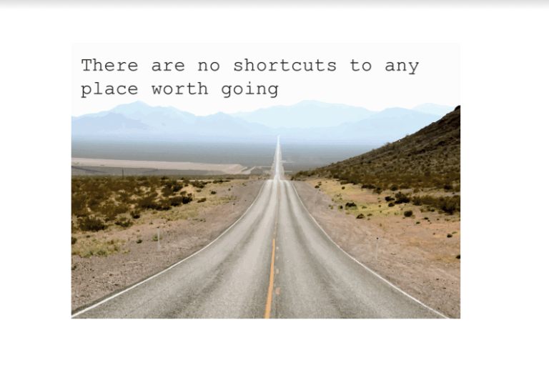
“There are no shortcuts to any place worth going”
The message here is that in order to get to a place or position you must put in 100% of your effort and not cut corners. If something was easy everyone would do it. To get to a good place you must not take shortcuts and go the full way.
Finished Posters and Design Process…
“Mama always said life is just like a box of Chocolate. You never know what your gonna get”

This is the finished result of Forrest Gump’s quote: “Mama always said life is just like a box of chocolate, You never quite know what you’re gonna get”.
Because this quote is comparing life with a box of chocolate I think that it was a good decision to design the quote on a box of chocolate. This was designed to look like it has two layers. The acheral box of chocolate and a ribbon.
The “Mama always said” part of the quote is on the chocolate box and the rest of the quote is on a ribbon. I think this works well because this is a similar design to a box of chocolate. I have also used premium colors to make it look like a luxury chocolate box.
Fonts I used:
In order for this poster to work properly I feel as though it is important use premium looking fonts. I spent a considerable amount of time on dafont.com to find the best suited fonts.

I choose the font Chocolate Box as the main one because it has a very luxury feel to it and suits my chosen branding very well. As the font is called chocolate box I know that it has been designed to be used on a box of chocolate.
 The Stardust font was used on the side of the box. I put it here because this is where the logo would often go. Putting it the start of the quote here with this font follows the branding of an average box of chocolate.

I also used this font to write Forrest Gump’s name. This is also a luxury looking font. Which I think fits in well with the rest of the design.
Design Process:
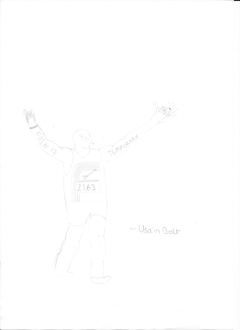
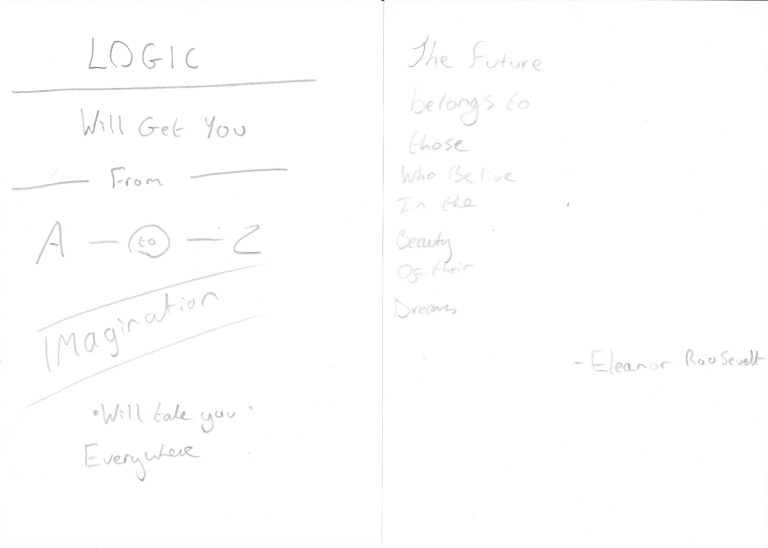
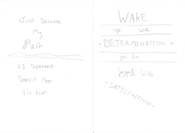
Before I Designed this poster on Adobe Illustrator CS5, I drew it by hand. This is a good method because it gives me an idea of what to create on the computer.
I have also taken screen shots of my progress in creating this poster.


“Education is the most powerful weapon for changing the world”.
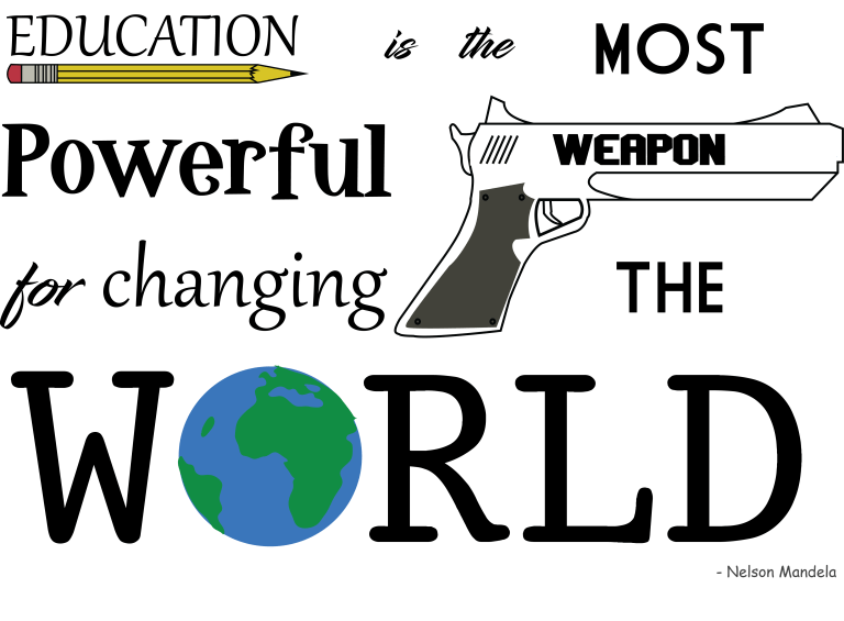
This is the poster that I created for Nelson Mandela’s quote. “Education is the most powerful weapon for changing the world”.
I think that this is a very good design because it is kept quite basic yet and easy to read. Yet it still contains many different fonts and drawings. In this quote the three key words are “Education”, “Weapon” and “World” I have highlighted these key words by drawing objects osiated with them around them. I think that this was a good idea because it demonstarights how you can be creative with text.The drawings also add color into the poster which makes it more interesting to look at and read.
Fonts I used:


Design Process:
Before I Designed this poster on Adobe Illustrator CS5, I drew it by hand. This is a good method because it gives me an idea of what to create on the computer.

I have also taken screen shots of my progress in creating this poster.


“The 98% of people who do not follow their dreams are employed by the 2% that do”.

I think that this is a very good quote which has a lot of meaning behind it. This quote shows that everyone has hopes and dreams but only 2% of the population acherally follow through with them. The once that do often manage to start good businesses / organisations which would then employ the 98% of people who did not follow their dreams. The message of this quote is; in order to get to the top you must follow through with your dreams to reach the better 2%
I also like the way that I have designed it. I think that it has a good design because it uses many different fonts which keeps the design creative. I have also used three different shades of blue which keeps the design very consistent.
Fonts I Used:


Design Process:
Before I Designed this poster on Adobe Illustrator CS5, I drew it by hand. This is a good method because it gives me an idea of what to create on the computer.

I have also taken screen shots of my progress in creating this poster.


I have also created other posters on Illustrator which aren’t as creative; For this reason I have chosen not to submit the posters below as my final three.

I have also drawn other designs. However I then decided not to make them into posters on Illustrator.